
Patient Characteristics and Readmission Modeling
Patient Characteristics and Readmission Modeling
Introduction
Hospital X seeks our expertise in comprehensively analyzing a decade’s worth of data on patient readmissions following discharge. The medical staff is seeking our assistance in determining whether initial diagnoses, number of procedures, or other factors can help better predict the probability of readmission. They hope to use the findings to target follow-up calls and attention to patients who are more likely to be readmitted.
Objectives
The main objective of this report is to explore patient characteristics and readmissions. It specifically aims to:
- Describe the overall and by age characteristics of the patients.
- Investigate and model the patient readmissions by their representing features.
- Identify patient groups with the best readmission rates.
Data Used
The hospital information used in this report is part of the clinical care at 130 US hospitals and integrated delivery networks. Below is a list of variables and their descriptions:

Acknowledgments: Beata Strack, Jonathan P. DeShazo, Chris Gennings, Juan L. Olmo, Sebastian Ventura, Krzysztof J. Cios, and John N. Clore, “Impact of HbA1c Measurement on Hospital Readmission Rates: Analysis of 70,000 Clinical Database Patient Records,” BioMed Research International, vol. 2014, Article ID 781670, 11 pages, 2014.
# ---------- Packages & Datasets

# Load pre-installed, required packages
suppressPackageStartupMessages(library(tidyverse))
suppressPackageStartupMessages(library(dplyr))
suppressPackageStartupMessages(library(ggplot2))
suppressPackageStartupMessages(library(scales))

# Install and load the 'ggfun' package
# For round rectangle borders and backgrounds in ggplots
suppressWarnings(suppressMessages(install.packages("ggfun", verbose=TRUE, quiet=TRUE)))
suppressPackageStartupMessages(library(ggfun))

# Install and load the 'ggchicklet' package
# For bar charts with rounded corners
suppressWarnings(suppressMessages(remotes::install_github("hrbrmstr/ggchicklet", auth_token = "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")))
suppressPackageStartupMessages(library("ggchicklet"))

# Install and load the 'ggthemes' package
# For using the look of a plot theme
suppressWarnings(suppressMessages(install.packages("ggthemes")))
suppressPackageStartupMessages(library(ggthemes))

# Install and load the 'patchwork' package
# For combining ggplots into the same graphic
suppressWarnings(suppressMessages(install.packages("patchwork", verbose=TRUE, quiet=TRUE)))
suppressPackageStartupMessages(library(patchwork))

# Install and load the "mlbench" package
#
#suppressWarnings(suppressMessages(install.packages("mlbench")))
#suppressPackageStartupMessages(library(mlbench))

# Install and load the "ggpubr" package
# For boxplots
suppressWarnings(suppressMessages(install.packages("ggpubr")))
suppressPackageStartupMessages(library("ggpubr"))

# Read 'readmissions' dataset
readmissions <- readr::read_csv('data/hospital_readmissions.csv', show_col_types = FALSE) %>%
	mutate_if(is.character,as.factor) %>%
	mutate_all(~ if_else(.x == "Missing", NA,.x))

#is.na(readmissions)
#colSums(is.na(readmissions))
#which(colSums(is.na(readmissions))>0)
#names(which(colSums(is.na(readmissions))>0))
#missmap(readmissions, col=c("blue", "red"), legend=FALSE)

#summary(readmissions)
#par(mfrow=c(1,6))
#for(i in 1:17) {
#    boxplot(readmissions[,i], main=names(readmissions)[i])
#}
The following package(s) will be installed:
- ggthemes [5.1.0]
These packages will be installed into "~/renv/library/linux-ubuntu-jammy/R-4.4/x86_64-pc-linux-gnu".

# Installing packages --------------------------------------------------------
- Installing ggthemes ...                       OK [linked from cache]
Successfully installed 1 package in 6.4 milliseconds.
The following package(s) will be installed:
- ggpubr [0.6.0]
These packages will be installed into "~/renv/library/linux-ubuntu-jammy/R-4.4/x86_64-pc-linux-gnu".

# Installing packages --------------------------------------------------------
- Installing ggpubr ...                         OK [linked from cache]
Successfully installed 1 package in 6.3 milliseconds.
# ----- For link's image thumbnail

# Install and load the 'png' package
# For superimposing PNG images in a ggplot
suppressWarnings(suppressMessages(install.packages("png", verbose=TRUE, quiet=TRUE)))
suppressPackageStartupMessages(library(png))

# Create a data
data <- data.frame(x = 1:3,
                   y = 1:3)

# Read the PNG file
my_image <- readPNG("documentation/cover_Fig10_diag_stacked_bar_plot.png", native = TRUE)

# Create a plot and combine with the image
ggplot(data, aes(x, y)) +
	geom_point() +
	theme_minimal() +
	theme(axis.title = element_blank(),
          axis.text = element_blank(),
          axis.line = element_blank(),
          axis.ticks = element_blank()) +
	inset_element(p = my_image,
                  left = -0.52,
                  bottom = -0.03,
                  right = 1.52,
                  top = 1.02)
Results and Discussion
Patient Characteristics
The following information describe the characteristics of the sample composing of 25,000 patients admitted to the hospital after being discharged.
Overall
Numerical
Age: The grouped mean and median ages are approximately 68 and 69, respectively, with a standard deviation of ~13, indicating that the hospital primarily admitted elderly patients. As shown in Figure 1, the distribution of patients across age groups is approximately symmetric at the mean.
# Frequency Distribution Table (FDT) for Age
age_fdt <- readmissions %>%
	select(age) %>%
	group_by(age) %>%
	count() %>%
	mutate(class_interval = paste(as.numeric(unlist(regmatches(age, gregexpr("[[:digit:]]+", age)))), collapse = "-"),
           class_mark = mean(as.numeric(unlist(regmatches(age, gregexpr("[[:digit:]]+", age)))))) %>%
	ungroup() %>%
	mutate(cum_freq = cumsum(n),
           n_times_cm = n*class_mark) %>%
	select(age, class_interval, everything())

# Create GroupedMedian() function to calculate the median of grouped data
# Reference: http://stackoverflow.com/a/18931054/1270695
GroupedMedian <- function(frequencies, intervals, sep = NULL, trim = NULL) {
  # If "sep" is specified, the function will try to create the
  #   required "intervals" matrix. "trim" removes any unwanted
  #   characters before attempting to convert the ranges to numeric.
  if (!is.null(sep)) {
    if (is.null(trim)) pattern <- ""
    else if (trim == "cut") pattern <- "\\[|\\]|\\(|\\)"
    else pattern <- trim
    intervals <- sapply(strsplit(gsub(pattern, "", intervals), sep), as.numeric)
  }

  Midpoints <- rowMeans(intervals)
  cf <- cumsum(frequencies)
  Midrow <- findInterval(max(cf)/2, cf) + 1
  L <- intervals[1, Midrow]      # lower class boundary of median class
  h <- diff(intervals[, Midrow]) # size of median class
  f <- frequencies[Midrow]       # frequency of median class
  cf2 <- cf[Midrow - 1]          # cumulative frequency class before median class
  n_2 <- max(cf)/2               # total observations divided by 2

  unname(L + (n_2 - cf2)/f * h)
}

# Grouped Mean, Median, and Sample SD
grouped_age_stats <- age_fdt %>%
 	summarize(Variable = "Age group",
			  "Mean" = sum(n_times_cm)/sum(n),
              "Std. Dev." = sqrt(sum(n*(Mean-class_mark)^2)/(sum(n))),
			  "Med." = GroupedMedian(frequencies = age_fdt$n, intervals = age_fdt$class_interval, sep = "-")
			 )

grouped_age_stats

# Bar plot
age_bar_plot <- ggplot(age_fdt, aes(group=1)) +
	geom_chicklet(aes(x = age,
                      y = n,
					  group=1),
                  color="white",
                  fill="#6C8CBF",
                  radius = grid::unit(1, "mm"), position="stack") +

	# Plot mean and median lines
	geom_vline(xintercept=3.344, color="red", linewidth=0.6) +

	ggtitle("Fig. 1: Bar Graph of the Patients' Age Groups\n") +
	labs(x="\nAge group", y="Number of patients\n") +
	scale_y_continuous(expand = c(0.01, 0), limits = c(0,7000),
                      breaks = seq(0, 7000, by=1000)) +
	theme_economist() +
	scale_color_economist() +
	theme(plot.title = element_text(size= 12),
          panel.grid.minor = element_line(color="grey",
                                          linetype="dashed",
                                          linewidth=0.3),
		  panel.grid.major = element_line(color="grey",
                                          linetype="dashed",
                                          linewidth=0.3),
          axis.ticks = element_blank()
         ) +
	annotate("text", x=2.7, y=6500,
			 label=paste("Mean = ",sum(age_fdt$n_times_cm)/sum(age_fdt$n)),
			 color="red",
			 size=3.5)
| Variable | Mean | Std. Dev. | Med. |
|---|---|---|---|
| <chr> | <dbl> | <dbl> | <dbl> |
| Age group | 68.4412 | 13.15607 | 69.3286 |

Time in hospital: The mean and median lengths of stay in the hospital are 4.4533 and 4, respectively, with a standard deviation of ~3. Figure 2 shows a positively skewed distribution for this patient feature.
# Summary statistics for numerical variables
sum_stats <- data.frame(
    Variable = readmissions %>%
		select_if(is.numeric) %>%
		colnames) %>%
	bind_cols(as.data.frame(t(readmissions %>%
                              summarise_if(is.numeric, list(mean)) %>%
                              bind_rows(readmissions %>%
                                        	summarise_if(is.numeric, list(sd)),
                                        readmissions %>%
                                        	summarise_if(is.numeric, list(min)),
                                        readmissions %>%
                                        	summarise_if(is.numeric, list(median)),
                                        readmissions %>%
                                        	summarise_if(is.numeric, list(max)))
                             )) %>%
              rename(Mean = V1,
                     `Std. Dev.` = V2,
                     `Min.` = V3,
                     `Median` = V4,
                     `Max.` = V5))

rownames(sum_stats) <- 1: nrow(sum_stats)
sum_stats

# time in hospital
time_in_hospital_dst_plot <- ggplot(readmissions, aes(x = time_in_hospital)) +
	geom_histogram(aes(y=after_stat(density)),
                   colour="white",
                   fill="#5AA7A7",
                   binwidth=1) +
	geom_density(alpha=0.2,
                 fill="#FF6666") +

	# Plot mean and median lines
	geom_vline(aes(xintercept = mean(time_in_hospital)), col="red", linewidth=0.6) +
	#geom_vline(aes(xintercept = median(time_in_hospital)), col="blue", linewidth=0.6) +

	ggtitle("Fig. 2: Distribution of the Time Length in Hospital\n") +
	labs(x="\nNumber of days (from 1 to 14)", y="Density\n") +
	scale_x_continuous(expand = c(0.01, 0),
                       breaks = seq(0, 14, by=2)) +
	scale_y_continuous(expand = c(0.01, 0),
                       limits = c(0,0.20),
                       breaks = seq(0,0.20, by=0.025)) +
	theme_economist() +
	scale_color_economist() +
	theme(plot.title = element_text(size= 12),
          panel.grid.minor = element_line(color="grey",
                                          linetype="dashed",
                                          linewidth=0.3),
		  panel.grid.major = element_line(color="grey",
                                          linetype="dashed",
                                          linewidth=0.3)
         ) +
	annotate("text", x=mean(readmissions$time_in_hospital)+1.45, y=(0.200+0.175)/2,
			 label=paste("Mean = ",round(mean(readmissions$time_in_hospital),4)),
			 color="red",
			 size=3.5)
| Variable | Mean | Std. Dev. | Min. | Median | Max. | |
|---|---|---|---|---|---|---|
| <chr> | <dbl> | <dbl> | <dbl> | <dbl> | <dbl> | |
| 1 | time_in_hospital | 4.45332 | 3.0014699 | 1 | 4 | 14 |
| 2 | n_lab_procedures | 43.24076 | 19.8186202 | 1 | 44 | 113 |
| 3 | n_procedures | 1.35236 | 1.7151793 | 0 | 1 | 6 |
| 4 | n_medications | 16.25240 | 8.0605318 | 1 | 15 | 79 |
| 5 | n_outpatient | 0.36640 | 1.1954782 | 0 | 0 | 33 |
| 6 | n_inpatient | 0.61596 | 1.1779511 | 0 | 0 | 15 |
| 7 | n_emergency | 0.18660 | 0.8858735 | 0 | 0 | 64 |

Number of procedures: The mean and median number of medical procedures performed during the hospital stay are 1.3524 and 1, with a standard deviation of 1.7152, respectively, whereas the mean and median numbers of laboratory procedures performed are 43.2408 and 44, respectively, with a standard deviation of 19.8186. This implies that throughout their hospitalization, patients underwent laboratory procedures more frequently than medical procedures.
Based on Figures 3 and 4, the two types of procedures exhibit dissimilar distributional characteristics, with medical procedures demonstrating positive skewness, and laboratory procedures showing slight symmetry.
# Number of Procedures
n_procedures_hs_dst_plot <- ggplot(readmissions, aes(x = n_procedures)) +
	geom_histogram(aes(y=after_stat(density)),
                   colour="white",
                   fill="#5AA7A7",
                   binwidth=0.5
                  ) +
	geom_density(alpha=0.2,
                 fill="#FF6666") +

	# Plot mean and median lines
	geom_vline(aes(xintercept = mean(n_procedures)), col="red", linewidth=0.6) +
	#geom_vline(aes(xintercept = median(n_procedures)), col="blue", linewidth=0.6) +

	ggtitle("Fig. 3: Distribution of the Number of Medical Procedures\n") +
	labs(x="\nNumber of procedures performed during the hospital stay", y="Density\n") +
	theme_economist() +
	scale_color_economist() +
	theme(plot.title = element_text(size= 12),
          panel.grid.minor = element_line(color="grey",
                                          linetype="dashed",
                                          linewidth=0.3),
		  panel.grid.major = element_line(color="grey",
                                          linetype="dashed",
                                          linewidth=0.3)
         ) +
	annotate("text", x=mean(readmissions$n_procedures)+0.72, y=0.7,
			 label=paste("Mean = ",round(mean(readmissions$n_procedures),4)),
			 color="red",
			 size=3.5)

# Number of Lab Procedures
n_lab_procedures_hs_dst_plot <- ggplot(readmissions, aes(x = n_lab_procedures)) +
	geom_histogram(aes(y=after_stat(density)),
                   colour="white",
                   fill="#5AA7A7",
                   binwidth=3
                  ) +
	geom_density(alpha=0.2,
                 fill="#FF6666") +

	# Plot mean and median lines
	geom_vline(aes(xintercept = mean(n_lab_procedures)), col="red", linewidth=0.6) +
	#geom_vline(aes(xintercept = median(n_lab_procedures)), col="blue", linewidth=0.6) +

	ggtitle("Fig. 4: Distribution of the Number of Laboratory Procedures\n") +
	labs(x="\nNumber of lab procedures performed during the hospital stay", y="Density\n") +
	theme_economist() +
	scale_color_economist() +
	theme(plot.title = element_text(size= 12),
          panel.grid.minor = element_line(color="grey",
                                          linetype="dashed",
                                          linewidth=0.3),
		  panel.grid.major = element_line(color="grey",
                                          linetype="dashed",
                                          linewidth=0.3)
         ) +
	annotate("text", x=mean(readmissions$n_lab_procedures)+14, y=0.025,
			 label=paste("Mean = ",round(mean(readmissions$n_lab_procedures),4)),
			 color="red",
			 size=3.5)

#ggarrange(n_procedures_hs_dst_plot, n_lab_procedures_hs_dst_plot,
#          ncol = 1, nrow = 2)

Number of medications: The mean and median numbers of medications administered during the hospital stay are 16.2524 and 15, with a standard deviation of 8.0605, as well as a slightly skewed distribution to the right.
# Number of Procedures
n_medications_hs_dst_plot <- ggplot(readmissions, aes(x = n_medications)) +
	geom_histogram(aes(y=after_stat(density)),
                   colour="white",
                   fill="#5AA7A7",
                   binwidth=1
                  ) +
	geom_density(alpha=0.2,
                 fill="#FF6666") +

	# Plot mean and median lines
	geom_vline(aes(xintercept = mean(n_medications)), col="red", linewidth=0.6) +
	#geom_vline(aes(xintercept = median(n_medications)), col="blue", linewidth=0.6) +

	ggtitle("Fig. 5: Distribution of the Number of Medications\n") +
	labs(x="\nNumber of medications administered during the hospital stay", y="Density\n") +
	scale_y_continuous(expand = c(0.01, 0),
                       limits = c(0,0.065),
                       breaks = seq(0,0.065, by=0.01)) +
	theme_economist() +
	scale_color_economist() +
	theme(plot.title = element_text(size= 12),
          panel.grid.minor = element_line(color="grey",
                                          linetype="dashed",
                                          linewidth=0.3),
		  panel.grid.major = element_line(color="grey",
                                          linetype="dashed",
                                          linewidth=0.3)
         ) +
	annotate("text", x=mean(readmissions$n_medications)+9, y=0.065,
			 label=paste("Mean = ",round(mean(readmissions$n_medications),4)),
			 color="red",
			 size=3.5)

Number of visits: The mean numbers of outpatient, inpatient, and emergency room visits in the year preceding a hospital stay are 0.3664, 0.616, and 0.1866, with medians of 0 for all types, and standard deviations of 1.1955, 1.178, and 0.8859, respectively. The numbers of visits for all types are positively skewed, indicating that visitation is not much frequent among patients a year prior to their hospitalization.
# Outpatient
n_outpatient_hs_dst_plot <- ggplot(readmissions, aes(x = n_outpatient)) +
	geom_histogram(aes(y=after_stat(density)),
                   colour="white",
                   fill="#5AA7A7",
                   binwidth=1
                  ) +
	geom_density(alpha=0.2,
                 fill="#FF6666") +

	# Plot mean and median lines
	geom_vline(aes(xintercept = mean(n_outpatient)), col="red", linewidth=0.6) +
	#geom_vline(aes(xintercept = median(n_outpatient)), col="blue", linewidth=0.6) +

	ggtitle("Fig. 6: Distribution of the Number of Outpatient Visits\n") +
	labs(x="\nNumber of outpatient visits in the year before a hospital stay", y="Density\n") +
	scale_y_continuous(expand = c(0.01, 0),
                       limits = c(0,1),
                       breaks = seq(0,1, by=0.2)) +
	scale_x_continuous(expand = c(0.01, 0),
                       #limits = c(0,75),
                       breaks = seq(0,35, by=5)) +
	theme_economist() +
	scale_color_economist() +
	theme(plot.title = element_text(size= 12),
          panel.grid.minor = element_line(color="grey",
                                          linetype="dashed",
                                          linewidth=0.3),
		  panel.grid.major = element_line(color="grey",
                                          linetype="dashed",
                                          linewidth=0.3)
         ) +
	annotate("text", x=3.6, y=0.97,
			 label=paste("Mean = ",round(mean(readmissions$n_outpatient),4)),
			 color="red",
			 size=3.5)

# Inpatient
n_inpatient_procedures_hs_dst_plot <- ggplot(readmissions, aes(x = n_inpatient)) +
	geom_histogram(aes(y=after_stat(density)),
                   colour="white",
                   fill="#5AA7A7",
                   binwidth=1
                  ) +
	geom_density(alpha=0.2,
                 fill="#FF6666") +

	# Plot mean and median lines
	geom_vline(aes(xintercept = mean(n_inpatient)), col="red", linewidth=0.6) +
	#geom_vline(aes(xintercept = median(n_inpatient)), col="blue", linewidth=0.6) +

	ggtitle("Fig. 7: Distribution of the Number of Inpatient Visits\n") +
	labs(x="\nNumber of inpatient visits in the year before the hospital stay", y="Density\n") +
	scale_y_continuous(expand = c(0.01, 0),
                       limits = c(0,1),
                       breaks = seq(0,1, by=0.2)) +
	scale_x_continuous(expand = c(0.01, 0),
                       #limits = c(0,75),
                       breaks = seq(0,18, by=3)) +
	theme_economist() +
	scale_color_economist() +
	theme(plot.title = element_text(size= 12),
          panel.grid.minor = element_line(color="grey",
                                          linetype="dashed",
                                          linewidth=0.3),
		  panel.grid.major = element_line(color="grey",
                                          linetype="dashed",
                                          linewidth=0.3)
         ) +
	annotate("text", x=2, y=0.97,
			 label=paste("Mean = ",round(mean(readmissions$n_inpatient),4)),
			 color="red",
			 size=3.5)

# Emergency
n_emergency_procedures_hs_dst_plot <- ggplot(readmissions, aes(x = n_emergency)) +
	geom_histogram(aes(y=after_stat(density)),
                   colour="white",
                   fill="#5AA7A7",
                   binwidth=1
                   ) +
	geom_density(alpha=0.2,
                 fill="#FF6666") +

	# Plot mean and median lines
	geom_vline(aes(xintercept = mean(n_emergency)), col="red", linewidth=0.6) +
	#geom_vline(aes(xintercept = median(n_emergency)), col="blue", linewidth=0.6) +

	ggtitle("Fig. 8: Distribution of the Number of Emergency Room Visits\n") +
	labs(x="\nNumber of visits to the emergency room in the year before the hospital stay", y="Density\n") +
	scale_y_continuous(expand = c(0.01, 0),
                       limits = c(0,1),
                       breaks = seq(0,1, by=0.2)) +
	scale_x_continuous(expand = c(0.01, 0),
                       #limits = c(0,75),
                       breaks = seq(0,75, by=10)) +
	theme_economist() +
	scale_color_economist() +
	theme(plot.title = element_text(size= 12),
          panel.grid.minor = element_line(color="grey",
                                          linetype="dashed",
                                          linewidth=0.3),
		  panel.grid.major = element_line(color="grey",
                                          linetype="dashed",
                                          linewidth=0.3)
         ) +
	annotate("text", x=6.7, y=0.97,
			 label=paste("Mean = ",round(mean(readmissions$n_emergency),4)),
			 color="red",
			 size=3.5)

#ggarrange(n_outpatient_hs_dst_plot,
#          n_inpatient_procedures_hs_dst_plot,
#          n_emergency_procedures_hs_dst_plot,
#          ncol = 1, nrow = 3)

Categorical
Medical Specialty: Of the 12,618 (50.47%) patients with a recorded admitting physician, 3,565 had an admitting physician whose specialty was Internal Medicine.
# Frequency Distribution Table (FDT) for the Specialty of the Admitting Physician
medical_specialty_fdt <- readmissions %>%
	select(medical_specialty) %>%
	group_by(medical_specialty) %>%
	count() %>%
	ungroup() %>%
	mutate(perc = label_percent(accuracy=0.01)(n/sum(n))) %>%
	arrange(desc(n))

# Age
medical_specialty_bar_plot <- ggplot(medical_specialty_fdt %>%
										filter(!is.na(medical_specialty))) +
	geom_chicklet(aes(x = fct_reorder(medical_specialty,n),
                      y = n),
                  fill=c("#6C8CBF"),
                  color="white",
                  radius = grid::unit(1, "mm"), position="stack",
				  na.rm = TRUE) +
	coord_flip() +
	ggtitle("Fig. 9: Bar Graph of the Specialty of Patients' Admitting Physician \n") +
	labs(y="\nNumber of patients", x="Specialty of the admitting physician\n") +
	theme_economist() +
	scale_color_economist() +
	theme(legend.position="bottom",
          legend.text = element_text(margin = margin(r = 2, unit = "pt"),
                                     size = 10),
          axis.ticks = element_blank(),
		  axis.text.y = element_text(size=10),
          legend.title = element_text(face="bold",
                                      size = 12),
          panel.grid.minor = element_line(color="grey",
                                          linetype="dashed",
                                          linewidth=0.3),
		  panel.grid.major = element_line(color="grey",
                                          linetype="dashed",
                                          linewidth=0.3),
          plot.title = element_text(hjust = 0,
                                    size= 12),
          legend.box.margin = margin(t=0, b=0, l=-95, unit='pt'))  +
	#scale_y_continuous(expand = c(0.01, 0),
    #                   limits = c(0, 13000),
    #                   breaks = seq(0, 13000, by=2000)) +
	scale_x_discrete(expand = c(0.11, 0),
					 labels = rev(c("Internal\nMedicine",
								"Other",
								"Emergency/\nTrauma",
								"Family/\nGeneral\nPractice",
							    "Cardiology",
							    "Surgery"))
					 )

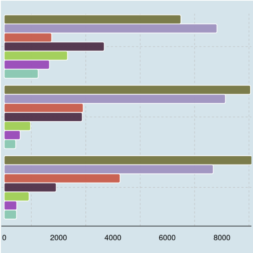
Diagnoses: Most of the circulatory diagnoses or 7,824 (31.30%) were identified as primary, whereas most of the patients who had a diagnosis other than circulatory, diabetes, digestive, injury, musculoskeletal, or respiratory received it as a secondary (9,056 or 36.22%) and additional secondary (9,107 or 36.43%).
# Table for the diagnoses
diag_tbl <- readmissions %>%
	select(diag_1, diag_2, diag_3) %>%
	pivot_longer(cols = c(1:3),
                 names_to = "diag_type",
                 values_to = "diag") %>%
	group_by(diag_type, diag) %>%
	summarize(n=n(), .groups="keep") %>%
	group_by(diag_type) %>%
	mutate(perc=label_percent(accuracy = 0.01)(n/sum(n))) %>%
	arrange(diag_type, desc(n)) %>%
	ungroup()


# Install and load the 'rwantshue' package
# For generating random color scheme
suppressWarnings(suppressMessages(install.packages("remotes")))
suppressWarnings(suppressMessages(remotes::install_github("hoesler/rwantshue", auth_token = "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")))
suppressPackageStartupMessages(library(rwantshue))

# Colorize the Physician's Specialty
color_scheme1 <- iwanthue(seed=1234, force_init=TRUE)
diag_colors <- color_scheme1$hex(length(levels(factor(diag_tbl$diag))))

#convert diagnostic type to factor and specify level order
diag_tbl$diag_type <- factor(diag_tbl$diag_type, levels=c('diag_3', 'diag_2', 'diag_1'))

diag_stacked_bar_plot <- ggplot(diag_tbl %>% filter(!is.na(diag))) +
	geom_chicklet(aes(x = diag_type, y = n,
                      fill = fct_reorder(diag, n)),
                  color="white",
                  alpha=0.95,
                  radius = grid::unit(0.75, "mm"),
                  position="dodge") +
	coord_flip() +
    #scale_x_discrete(labels = c("Additional Secondary", "Secondary", "Primary")) +
	ggtitle("Fig. 10: Stacked Bar Graph of the Patients' Diagnoses\n") +
	labs(x="Diagnosis Type\n", y="\nNumber of patients", fill="Diagnosis: ") +
	theme_economist() +
	scale_color_economist() +
    guides(fill = guide_legend(ncol=3,
                               reverse = TRUE,
                               override.aes = list(shape = 15,
                                                   size = 4),
                               title.position="top")) +
	theme(legend.position="bottom",
          legend.text = element_text(margin = margin(r = 2, unit = "pt"),
                                     size = 10),
          axis.ticks = element_blank(),
		  axis.text.y = element_text(size=10),
          legend.title = element_text(face="bold",
                                      size = 12),
          panel.grid.minor = element_line(color="grey",
                                          linetype="dashed",
                                          linewidth=0.3),
		  panel.grid.major = element_line(color="grey",
                                          linetype="dashed",
                                          linewidth=0.3),
          plot.title = element_text(hjust = 0,
                                    size= 12),
          legend.box.margin = margin(t=0, b=0, l=-135, unit='pt')) +
	scale_fill_manual(values = diag_colors#,
					  #labels = rev(c("Missing",
					#			"Circulatory",
					#				 "Other",
					#			"Diabetes",
					#		    "Respiratory",
					#		    "Digestive",
					#			"Injury",
					#			"Musculoskeletal"))
					 ) +
	scale_y_continuous(expand = c(0.01, 0),
		               limits = c(0, 10200),
                       breaks = seq(0, 10200, by=2000)) +
	scale_x_discrete(expand = c(0.275, 0),
                    labels = c("Additional\nSecondary", "Secondary", "Primary"))
The following package(s) will be installed:
- remotes [2.5.0]
These packages will be installed into "~/renv/library/linux-ubuntu-jammy/R-4.4/x86_64-pc-linux-gnu".
# Installing packages --------------------------------------------------------
- Installing remotes ... OK [linked from cache]
Successfully installed 1 package in 6.1 milliseconds.
curl (5.2.1 -> 5.2.3 ) [CRAN]
jsonlite (1.8.8 -> 1.8.9 ) [CRAN]
Rcpp (1.0.12 -> 1.0.13-1) [CRAN]
V8 (4.4.2 -> 6.0.0 ) [CRAN]
[36m──[39m [36mR CMD build[39m [36m─────────────────────────────────────────────────────────────────[39m
* checking for file ‘/tmp/Rtmpvo1Xrr/remotes193d3d1cdf74/hoesler-rwantshue-07a58c7/DESCRIPTION’ ... OK
* preparing ‘rwantshue’:
* checking DESCRIPTION meta-information ... OK
* checking for LF line-endings in source and make files and shell scripts
* checking for empty or unneeded directories
Omitted ‘LazyData’ from DESCRIPTION
* building ‘rwantshue_0.0.3.tar.gz’

Prediabetes test results: A total of 20,938 (83.75%) had not performed an A1C test, while 23,625 (94.50%) had not performed a glucose test. For those who had performed, however, a high result was seen more than a normal one for A1C tests and almost equal number in high and normal results for glucose test.
# Table for Prediabetes tests
diab_test_tbl <- readmissions %>%
	select(glucose_test, A1Ctest) %>%
	rename(A1C = A1Ctest,
           Glucose = glucose_test) %>%
	pivot_longer(cols = c(1:2),
                 names_to = "prediab_test",
                 values_to = "result") %>%
	group_by(prediab_test, result) %>%
	summarize(n=n(), .groups="keep") %>%
	group_by(prediab_test) %>%
	mutate(perc=label_percent(accuracy = 0.01)(n/sum(n))) %>%
	arrange(prediab_test, desc(n)) %>%
	ungroup()

#convert test result type to factor and specify level order
diab_test_tbl$result <- factor(diab_test_tbl$result, levels=c("no",'normal','high'))

diab_test_stacked_bar_plot <- ggplot(diab_test_tbl) +
	geom_chicklet(aes(x = fct_reorder(prediab_test, n), y = n,
                      fill = result),
                  color="white",
                  alpha=0.95,
                  radius = grid::unit(0.75, "mm"),
                  position="dodge") +
	coord_flip() +
	scale_fill_manual(values = c("#838484", "#8BD69D", "#BD3E38"),
                      labels = c("Not Performed", "Normal", "High")
                     ) +
	ggtitle("Fig. 11: Stacked Bar Graph of the Patients' Prediabetes Test Results\n") +
	labs(x="Prediabetes test\n", y="\nNumber of patients", fill="Test Result:  ") +
	theme_economist() +
	scale_color_economist() +
    guides(fill = guide_legend(ncol=3,
                               reverse = TRUE,
                               override.aes = list(shape = 15,
                                                   size = 4),
                               title.position="top")) +
	theme(legend.position="bottom",
          legend.text = element_text(margin = margin(r = 2, unit = "pt"),
                                     size = 10),
          legend.title = element_text(face="bold",
                                      size = 12),
          axis.ticks = element_blank(),
		  axis.text.y = element_text(size=10),
          panel.grid.minor = element_line(color="grey",
                                          linetype="dashed",
                                          linewidth=0.3),
		  panel.grid.major = element_line(color="grey",
                                          linetype="dashed",
                                          linewidth=0.3),
          plot.title = element_text(hjust = 0,
                                    size= 12),
          legend.box.margin = margin(t=0, b=0, l=-200, unit='pt')) +
	scale_y_continuous(expand = c(0.01, 0),
		               limits = c(0, 25000),
                       breaks = seq(0, 24000, by=4000)) +
	scale_x_discrete(expand = c(0.5, 0))

Diabetes medication: Among all the patients, 19,228 (76.91%) had been prescribed a diabetes medication, while 13,497 (53.99%) had not changed diabetes medication.
# Table for change
diab_ques_tbl <- readmissions %>%
	select(change, diabetes_med) %>%
	rename("Was there a  \nchange in the \ndiabetes \nmedication?" = change,
           "Was there a  \nprescribed \ndiabetes \nmedication?"= diabetes_med) %>%
	pivot_longer(cols = c(1:2),
                 names_to = "diab_ques",
                 values_to = "response") %>%
	group_by(diab_ques, response) %>%
	summarize(n=n(), .groups="keep") %>%
	group_by(diab_ques) %>%
	mutate(perc=label_percent(accuracy = 0.01)(n/sum(n))) %>%
	arrange(diab_ques, desc(n)) %>%
	ungroup()

diab_ques_stacked_bar_plot <- ggplot(diab_ques_tbl) +
	geom_chicklet(aes(x = fct_reorder(diab_ques, n), y = n,
                      fill = fct_reorder(response, n)),
                  color="white",
                  alpha=0.95,
                  radius = grid::unit(0.75, "mm"),
                  position="stack") +
	coord_flip() +
    scale_fill_manual(values = c("#EE6C4D", "#98C1D9"),
                      labels = c("No", "Yes")
                     ) +
	ggtitle("Fig. 12: Stacked Bar Graph of the Patient's Response to Questions Related to\n             Diabetes Medication\n") +
	labs(x="Question\n", y="\nNumber of patients", fill="Response:  ") +
	theme_economist() +
	scale_color_economist() +
    guides(fill = guide_legend(ncol=2,
                               reverse = TRUE,
                               override.aes = list(shape = 15,
                                                   size = 4),
                               title.position="top")) +
	theme(legend.position="bottom",
          legend.text = element_text(margin = margin(r = 2, unit = "pt"),
                                     size = 10),
          legend.title = element_text(face="bold",
                                      size = 12),
          axis.ticks = element_blank(),
		  axis.text.y = element_text(size=9.5),
          panel.grid.minor = element_line(color="grey",
                                          linetype="dashed",
                                          linewidth=0.3),
		  panel.grid.major = element_line(color="grey",
                                          linetype="dashed",
                                          linewidth=0.3),
          plot.title = element_text(hjust = 0,
                                    size= 10),
          legend.box.margin = margin(t=0, b=0, l=-290, unit='pt')) +
	scale_y_continuous(expand = c(0.01, 0),
		               limits = c(),
                       breaks = seq(0, 25000, by=3000)) +
	scale_x_discrete(expand = c(0.5, 0))

diab_ques_tbl
| diab_ques | response | n | perc |
|---|---|---|---|
| <chr> | <fct> | <int> | <chr> |
| Was there a change in the diabetes medication? | no | 13497 | 53.99% |
| Was there a change in the diabetes medication? | yes | 11503 | 46.01% |
| Was there a prescribed diabetes medication? | yes | 19228 | 76.91% |
| Was there a prescribed diabetes medication? | no | 5772 | 23.09% |

# Table for change in diabetes medication
change_tbl <- readmissions %>%
  count(change, sort = TRUE) %>%
	mutate(proportion = n/sum(n),
           #Attribute = "change in the diabetes medication",
           Percentage = label_percent(accuracy=0.01)(proportion),
           lab.ypos = cumsum(proportion) - 0.6*proportion)

# Create a pie chart
change_pie_chart <- ggplot(change_tbl, aes(x = "", y = proportion, fill = change)) +
    geom_bar(width=1,
             stat = "identity",
             color = "white",
             linewidth=0.4) +
    coord_polar("y", start = 0, direction = -1) +
    geom_text(aes(y = lab.ypos,
                  label = paste(label_percent(accuracy=0.01)(proportion),
                                "\n (", prettyNum(n,
                                                  big.mark=","),")",
                                sep="")), color = "grey5",  size = 5) +
    scale_fill_manual(values = c("#EE6C4D", "#98C1D9"),
                      labels = c("No", "Yes")
                     ) +
	ggtitle("Fig. 13: Pie Chart of Patient Distribution in Terms of the Change \nin Diabetes Medication") +
	labs(x="", y="",
         fill="Was there a change in the patient's diabetes medication?") +
	scale_x_discrete(expand = c(0.01, 0)) +
	theme_economist() +
	scale_color_economist() +
	theme(legend.position="bottom",
          legend.text = element_text(margin = margin(r = 2, unit = "pt"),
                                     size=10),
          legend.title = element_text(face="bold",
                                      size = 11),
          axis.title = element_blank(),
          axis.text = element_blank(),
          axis.line = element_blank(),
          axis.ticks = element_blank(),
          panel.grid.minor = element_blank(),
		  panel.grid.major = element_blank(),
          plot.background = element_rect(fill = "#D5E4EB"),
          plot.title = element_text(vjust=7,
                                    hjust=0.5,
                                    size=14,
                                    margin = margin(0,0,-30,0)),
          plot.margin = unit(c(1.5,2,0.5,2), "cm"),
          legend.box.margin = margin(t=-30, b=32, l=0, unit='pt')
         ) +
    guides(fill = guide_legend(reverse=TRUE,
                               override.aes = list(shape = 15,
                                                   size = 6),
                               title.position="top"))

Readmission: A slightly higher number of patients were not readmitted to the hospital compared to those who were readmitted. The blue bar represents the number of patients who were readmitted, which is 11,754 (47.02%), while the orange bar represents the number of patients who were not readmitted, which is 13,246 (52.98%)
# Frequency Distribution Table (FDT) for the Readmission
readmitted_fdt <- readmissions %>%
	select(readmitted) %>%
	group_by(readmitted) %>%
	count() %>%
	ungroup() %>%
	mutate(perc = label_percent(accuracy=0.01)(n/sum(n))) %>%
	arrange(desc(n))

# Age
readmitted_bar_plot <- ggplot(readmitted_fdt) +
	geom_chicklet(aes(x = fct_reorder(readmitted,n),
                      y = n),
                   fill=c("#EE6C4D", "#98C1D9"),
                  color="white",
                  radius = grid::unit(1, "mm"), position="stack") +
	coord_flip() +
	ggtitle("Fig. 13: Bar Graph of the Patients' Readmission \n") +
	labs(y="\nNumber of patients", x="Readmitted\n") +
	theme_economist() +
	scale_color_economist() +
	theme(legend.position="bottom",
          legend.text = element_text(margin = margin(r = 2, unit = "pt"),
                                     size = 10),
          axis.ticks = element_blank(),
          legend.title = element_text(face="bold",
                                      size = 12),
          panel.grid.minor = element_line(color="grey",
                                          linetype="dashed",
                                          linewidth=0.3),
		  panel.grid.major = element_line(color="grey",
                                          linetype="dashed",
                                          linewidth=0.3),
          plot.title = element_text(hjust = 0,
                                    size= 12),
          legend.box.margin = margin(t=0, b=0, l=-95, unit='pt'))  +
	scale_y_continuous(expand = c(0.01, 0),
                       limits = c(0, 14500),
                       breaks = seq(0, 14500, by=2000)) +
	scale_x_discrete(expand = c(0.52, 0),
					 labels = c("Yes", "No"))
readmitted_fdt
| readmitted | n | perc |
|---|---|---|
| <fct> | <int> | <chr> |
| no | 13246 | 52.98% |
| yes | 11754 | 47.02% |

By Age
Numbers
The following statements can be said about the age groups’ hospital stay through the comparisons of their seven (7) discrete numerical features. In general,
Time in hospital: Groups within the age of [60-100) had the most number of hospital days of about four.</br> Number of procedures: Groups aged [40-80] had at least one medical procedure performed, whereas groups aged [80-100] had none; all age groups had a high number of laboratory procedures performed ranging from 43-46.</br> Number of medications: The [60-70) group had the most number of medications of 17; as the patient moves one age group away from it, the number decreases by 1 or 2. </br> Number of visits: Outpatient, inpatient, and emergency room visits were not very common (close to zero) before hospitalization for all age groups.
Categories
Medical specialty: We can see from Figure 14 graph the distribution of patients varies across different age groups and specialties. Among the patients with information about their physician’s specialty, most, if not all, age groups seem to be admitted by a physician of Internal Medicine, while specialties categorized as ‘Others’ were second.
# Summary statistics of age groups' time in hospital
age_time_in_hospital_stats <- readmissions %>%
	group_by(age) %>%
	filter(!is.na(age), !is.na(time_in_hospital)) %>%
	summarize(mean_time_in_hospital = mean(time_in_hospital),
              sd_time_in_hospital = sd(time_in_hospital),
              min_time_in_hospital = min(time_in_hospital),
              first_time_in_hospital = quantile(time_in_hospital, probs=0.25),
              median_time_in_hospital = median(time_in_hospital),
              third_quartile_time_in_hospital = quantile(time_in_hospital, probs=0.75),
              max_time_in_hospital = max(time_in_hospital)) %>%
	arrange(desc(median_time_in_hospital), desc(mean_time_in_hospital))

# Summary statistics of age groups' number of procedures
age_n_procedures_stats <- readmissions %>%
	group_by(age) %>%
	filter(!is.na(age), !is.na(n_procedures)) %>%
	summarize(mean_n_procedures = mean(n_procedures),
              sd_n_procedures = sd(n_procedures),
              min_n_procedures = min(n_procedures),
              first_n_procedures = quantile(n_procedures, probs=0.25),
              median_n_procedures = median(n_procedures),
              third_n_procedures = quantile(n_procedures, probs=0.75),
              max_n_procedures = max(n_procedures)) %>%
	arrange(desc(median_n_procedures), desc(mean_n_procedures))

# Summary statistics of age groups' number of lab procedures
age_n_lab_procedures_stats <- readmissions %>%
	group_by(age) %>%
	filter(!is.na(age), !is.na(n_lab_procedures)) %>%
	summarize(mean_n_lab_procedures = mean(n_lab_procedures),
              sd_n_lab_procedures = sd(n_lab_procedures),
              min_n_lab_procedures = min(n_lab_procedures),
              first_n_lab_procedures = quantile(n_lab_procedures, probs=0.25),
              median_n_lab_procedures = median(n_lab_procedures),
              third_n_lab_procedures = quantile(n_lab_procedures, probs=0.75),
              max_n_lab_procedures = max(n_lab_procedures))  %>%
	arrange(desc(median_n_lab_procedures), desc(mean_n_lab_procedures))

# Summary statistics of age groups' number of medications
age_n_medications_stats <- readmissions %>%
	group_by(age) %>%
	filter(!is.na(age), !is.na(n_medications)) %>%
	summarize(mean_n_medications = mean(n_medications),
              sd_n_medications = sd(n_medications),
              min_n_medications = min(n_medications),
              first_n_medications = quantile(n_medications, probs=0.25),
              median_n_medications = median(n_medications),
              third_n_medications = quantile(n_medications, probs=0.75),
              max_n_medications = max(n_medications))  %>%
	arrange(desc(median_n_medications), desc(mean_n_medications))

# Summary statistics of age groups' number of outpatient visits
age_n_outpatient_stats <- readmissions %>%
	group_by(age) %>%
	filter(!is.na(age), !is.na(n_outpatient)) %>%
	summarize(mean_n_outpatient = mean(n_outpatient),
              sd_n_outpatient = sd(n_outpatient),
              min_n_outpatient = min(n_outpatient),
              first_n_outpatient = quantile(n_outpatient, probs=0.25),
              median_n_outpatient = median(n_outpatient),
              third_n_outpatient = quantile(n_outpatient, probs=0.75),
              max_n_outpatient = max(n_outpatient))  %>%
	arrange(desc(median_n_outpatient), desc(mean_n_outpatient))

# Summary statistics of age groups' number of inpatient visits
age_n_inpatient_stats <- readmissions %>%
	group_by(age) %>%
	filter(!is.na(age), !is.na(n_inpatient)) %>%
	summarize(mean_n_inpatient = mean(n_inpatient),
              sd_n_inpatient = sd(n_inpatient),
              min_n_inpatient = min(n_inpatient),
              first_n_inpatient = quantile(n_inpatient, probs=0.25),
              median_n_inpatient = median(n_inpatient),
              third_n_inpatient = quantile(n_inpatient, probs=0.75),
              max_n_inpatient = max(n_inpatient))  %>%
	arrange(desc(median_n_inpatient), desc(mean_n_inpatient))

# Summary statistics of age groups' number of ER visits
age_n_emergency_stats <- readmissions %>%
	group_by(age) %>%
	filter(!is.na(age), !is.na(n_emergency)) %>%
	summarize(mean_n_emergency = mean(n_emergency),
              sd_n_emergency = sd(n_emergency),
              min_n_emergency = min(n_emergency),
              first_n_emergency = quantile(n_emergency, probs=0.25),
              median_n_emergency = median(n_emergency),
              third_n_emergency = quantile(n_emergency, probs=0.75),
              max_n_emergency = max(n_emergency))  %>%
	arrange(desc(median_n_emergency), desc(mean_n_emergency))


plyr::join_all(list(age_time_in_hospital_stats %>%
			   	select(age, median_time_in_hospital#, mean_time_in_hospital
					  ),
			   age_n_procedures_stats %>%
		      	select(age, median_n_procedures#, mean_n_procedures
					  ),
			   age_n_lab_procedures_stats %>%
			  	select(age, median_n_lab_procedures#, mean_n_lab_procedures
					  ),
			   age_n_medications_stats %>%
			  	select(age, median_n_medications#, mean_n_medications
					  ),
			   age_n_outpatient_stats %>%
			  	select(age, median_n_outpatient#, mean_n_outpatient
					  ),
			   age_n_inpatient_stats %>%
			  	select(age, median_n_inpatient#, mean_n_inpatient
					  ),
			   age_n_emergency_stats %>%
			  	select(age, median_n_emergency#, mean_n_emergency
					  )),
	by='age') %>%
		arrange(desc(age))

plyr::join_all(list(age_time_in_hospital_stats %>%
			   	select(age, mean_time_in_hospital
					  ),
			   age_n_procedures_stats %>%
		      	select(age, mean_n_procedures
					  ),
			   age_n_lab_procedures_stats %>%
			  	select(age, mean_n_lab_procedures
					  ),
			   age_n_medications_stats %>%
			  	select(age, mean_n_medications
					  ),
			   age_n_outpatient_stats %>%
			  	select(age, mean_n_outpatient
					  ),
			   age_n_inpatient_stats %>%
			  	select(age, mean_n_inpatient
					  ),
			   age_n_emergency_stats %>%
			  	select(age, mean_n_emergency
					  )),
	by='age') %>%
		arrange(desc(age))
| age | median_time_in_hospital | median_n_procedures | median_n_lab_procedures | median_n_medications | median_n_outpatient | median_n_inpatient | median_n_emergency |
|---|---|---|---|---|---|---|---|
| <fct> | <dbl> | <dbl> | <dbl> | <dbl> | <dbl> | <dbl> | <dbl> |
| [90-100) | 4 | 0 | 45 | 13 | 0 | 0 | 0 |
| [80-90) | 4 | 0 | 46 | 14 | 0 | 0 | 0 |
| [70-80) | 4 | 1 | 45 | 15 | 0 | 0 | 0 |
| [60-70) | 4 | 1 | 44 | 16 | 0 | 0 | 0 |
| [50-60) | 3 | 1 | 43 | 15 | 0 | 0 | 0 |
| [40-50) | 3 | 1 | 44 | 14 | 0 | 0 | 0 |
| age | mean_time_in_hospital | mean_n_procedures | mean_n_lab_procedures | mean_n_medications | mean_n_outpatient | mean_n_inpatient | mean_n_emergency |
|---|---|---|---|---|---|---|---|
| <fct> | <dbl> | <dbl> | <dbl> | <dbl> | <dbl> | <dbl> | <dbl> |
| [90-100) | 4.762667 | 0.6853333 | 43.97467 | 13.87333 | 0.2613333 | 0.5573333 | 0.1386667 |
| [80-90) | 4.813773 | 0.9694420 | 44.34965 | 15.29562 | 0.4007972 | 0.6045173 | 0.1472542 |
| [70-80) | 4.599093 | 1.3760421 | 43.57920 | 16.36142 | 0.3965189 | 0.6011409 | 0.1351470 |
| [60-70) | 4.384407 | 1.5996956 | 42.59716 | 17.22307 | 0.3757822 | 0.6074751 | 0.1603247 |
| [50-60) | 4.154537 | 1.5188679 | 42.48967 | 16.69946 | 0.3270440 | 0.6118598 | 0.2295597 |
| [40-50) | 4.011453 | 1.2985782 | 42.95537 | 15.31635 | 0.3021327 | 0.7207741 | 0.3957346 |
# Specialty of admitting physician by age group
age_and_medical_specialty_counts <- readmissions %>%
	group_by(age, medical_specialty) %>%
	summarize(n = n(), .groups = "drop_last") %>%
	mutate(perc = label_percent(accuracy=0.01)(n/sum(n))) %>%
	arrange(age, desc(n)) %>%
	ungroup()

# Colorize the Physician's Specialty
color_scheme <- iwanthue(seed=1234, force_init=TRUE)
medical_specialty_colors <- color_scheme$hex(length(levels(factor(age_and_medical_specialty_counts$medical_specialty))))

# Bar plot
age_medical_specialty_bar_plot <- ggplot(age_and_medical_specialty_counts %>%
										 	filter(!is.na(medical_specialty))) +
	geom_chicklet(aes(x = age, y = n,
                      fill = fct_reorder(medical_specialty, n)),
                  color="white",
                  radius = grid::unit(1, "mm"), position="stack") +
	ggtitle("Fig. 14: Stacked Bar Graph of the Patients' Age Groups by the\n                                  Specialty of the Admitting Physician\n") +
	labs(x="\nDiagnosis", y="Number of patients\n", fill="Specialty of the Admitting Physician: ") +
	scale_x_discrete(expand = c(0.01, 0)) +
	theme_economist() +
	scale_color_economist() +
    guides(fill = guide_legend(ncol=4,nrow=2,
                               reverse = FALSE,
                               override.aes = list(shape = 15,
                                                   size = 4),
                               title.position="top")) +
	theme(legend.position="bottom",
          legend.text = element_text(margin = margin(r = 2, unit = "pt"),
                                     size = 10),
          legend.title = element_text(face="bold",
                                      size = 12),
          axis.ticks = element_blank(),
          panel.grid.minor = element_line(color="grey",
                                          linetype="dashed",
                                          linewidth=0.3),
		  panel.grid.major = element_line(color="grey",
                                          linetype="dashed",
                                          linewidth=0.3),
          plot.title = element_text(hjust = -0.9,
                                    size= 14),
          legend.box.margin = margin(t=0, b=0, l=-78, unit='pt')) +
	scale_y_continuous(expand = c(0.01, 0),
                       breaks = seq(0, 3500, by=500)) +
	scale_fill_manual(values = medical_specialty_colors)
age_and_medical_specialty_counts
| age | medical_specialty | n | perc |
|---|---|---|---|
| <fct> | <fct> | <int> | <chr> |
| [40-50) | NA | 1186 | 46.84% |
| [40-50) | InternalMedicine | 352 | 13.90% |
| [40-50) | Other | 322 | 12.72% |
| [40-50) | Family/GeneralPractice | 234 | 9.24% |
| [40-50) | Emergency/Trauma | 208 | 8.21% |
| [40-50) | Surgery | 116 | 4.58% |
| [40-50) | Cardiology | 114 | 4.50% |
| [50-60) | NA | 2123 | 47.69% |
| [50-60) | InternalMedicine | 608 | 13.66% |
| [50-60) | Other | 546 | 12.26% |
| [50-60) | Family/GeneralPractice | 336 | 7.55% |
| [50-60) | Emergency/Trauma | 304 | 6.83% |
| [50-60) | Cardiology | 290 | 6.51% |
| [50-60) | Surgery | 245 | 5.50% |
| [60-70) | NA | 2978 | 50.36% |
| [60-70) | Other | 714 | 12.08% |
| [60-70) | InternalMedicine | 706 | 11.94% |
| [60-70) | Family/GeneralPractice | 396 | 6.70% |
| [60-70) | Emergency/Trauma | 390 | 6.60% |
| [60-70) | Cardiology | 383 | 6.48% |
| [60-70) | Surgery | 346 | 5.85% |
| [70-80) | NA | 3363 | 49.19% |
| [70-80) | InternalMedicine | 1055 | 15.43% |
| [70-80) | Other | 725 | 10.60% |
| [70-80) | Family/GeneralPractice | 495 | 7.24% |
| [70-80) | Emergency/Trauma | 462 | 6.76% |
| [70-80) | Cardiology | 412 | 6.03% |
| [70-80) | Surgery | 325 | 4.75% |
| [80-90) | NA | 2360 | 52.26% |
| [80-90) | InternalMedicine | 705 | 15.61% |
| [80-90) | Emergency/Trauma | 430 | 9.52% |
| [80-90) | Family/GeneralPractice | 349 | 7.73% |
| [80-90) | Other | 319 | 7.06% |
| [80-90) | Cardiology | 198 | 4.38% |
| [80-90) | Surgery | 155 | 3.43% |
| [90-100) | NA | 372 | 49.60% |
| [90-100) | InternalMedicine | 139 | 18.53% |
| [90-100) | Emergency/Trauma | 91 | 12.13% |
| [90-100) | Family/GeneralPractice | 72 | 9.60% |
| [90-100) | Other | 38 | 5.07% |
| [90-100) | Surgery | 26 | 3.47% |
| [90-100) | Cardiology | 12 | 1.60% |

Diagnoses: Figures 15-16 demonstrates the patient distribution across age groups and primary, secondary, and additional secondary diagnoses. Diagnoses other than the six listed were given to patients in most, if not all, age groups among these three types of diagnosis.
# Primary diagnosis by age group
age_and_diag_1_counts <- readmissions %>%
	group_by(age, diag_1) %>%
	summarize(n = n(), .groups = "drop_last") %>%
	mutate(perc = label_percent(accuracy=0.01)(n/sum(n))) %>%
	arrange(age, desc(n)) %>%
	ungroup()

# Colorize
color_scheme <- iwanthue(seed=1234, force_init=TRUE)
diag_1_colors <- color_scheme$hex(length(levels(factor(age_and_diag_1_counts$diag_1,
                                                      levels = c('Circulatory',
                                                                 'Diabetes',
                                                                 'Digestive',
                                                                 'Injury',
                                                                 'Musculoskeletal',
                                                                 'Respiratory',
                                                                 'Other'),
                                                       order = TRUE))))

# Bar plot
age_diag_bar_plot <- ggplot(age_and_diag_1_counts %>%
								filter(!is.na(diag_1))) +
	geom_chicklet(aes(x = age, y = n,
                      fill = fct_reorder(diag_1,n)),
                  radius = grid::unit(1, "mm"), position="stack") +
	ggtitle("Fig. 15: Stacked Bar Graph of the Patients' Age Groups by Primary Diagnoses\n") +
	labs(x="", y="Number of patients\n", fill="Diagnosis: ") +
	scale_x_discrete(expand = c(0.01, 0)) +
	theme_economist() +
	scale_color_economist() +
    guides(fill = guide_legend(ncol=4,nrow=2,
                               reverse = FALSE,
                               override.aes = list(shape = 15,
                                                   size = 4),
                               title.position="top")) +
	theme(legend.position="none",
          legend.text = element_text(margin = margin(r = 2, unit = "pt"),
                                     size = 10),
          legend.title = element_text(face="bold",
                                      size = 12),
          axis.ticks = element_blank(),
          axis.title.x=element_blank(),
          axis.text.x=element_blank(),
          panel.grid.minor = element_line(color="grey",
                                          linetype="dashed",
                                          linewidth=0.3),
		  panel.grid.major = element_line(color="grey",
                                          linetype="dashed",
                                          linewidth=0.3),
          plot.title = element_text(hjust = 0,
                                    size= 11),
          legend.box.margin = margin(t=0, b=0, l=-95, unit='pt')
         ) +
	scale_y_continuous(expand = c(0.01, 0),
                       breaks = seq(0, 7500, by=2000)) +
	scale_fill_manual(values = diag_1_colors)

# Secondary diagnosis by age group
age_and_diag_2_counts <- readmissions %>%
	group_by(age, diag_2) %>%
	summarize(n = n(), .groups = "drop_last") %>%
	mutate(perc = label_percent(accuracy=0.01)(n/sum(n))) %>%
	arrange(age, desc(n)) %>%
	ungroup()

# Colorize
color_scheme2 <- iwanthue(seed=1234, force_init=TRUE)
diag_2_colors <- color_scheme2$hex(length(levels(factor(age_and_diag_2_counts$diag_2,
                                                      levels = c('Circulatory',
                                                                 'Diabetes',
                                                                 'Digestive',
                                                                 'Injury',
                                                                 'Musculoskeletal',
                                                                 'Respiratory',
                                                                 'Other'),
                                                       order = TRUE))))

# Bar plot
age_diag_2_bar_plot <- ggplot(age_and_diag_2_counts %>%
								filter(!is.na(diag_2))) +
	geom_chicklet(aes(x = age, y = n,
                      fill = fct_reorder(diag_2,n)),
                  radius = grid::unit(1, "mm"), position="stack") +
	ggtitle("Fig. 16: Stacked Bar Graph of the Patients' Age Groups by Secondary Diagnoses\n") +
	labs(x="", y="Number of patients\n", fill="Secondary Diagnosis: ") +
	scale_x_discrete(expand = c(0.01, 0)) +
	theme_economist() +
	scale_color_economist() +
    guides(fill = guide_legend(ncol=4,nrow=2,
                               reverse = FALSE,
                               override.aes = list(shape = 15,
                                                   size = 4),
                               title.position="top")) +
	theme(legend.position="none",
          legend.text = element_text(margin = margin(r = 2, unit = "pt"),
                                     size = 10),
          legend.title = element_text(face="bold",
                                      size = 12),
          axis.ticks = element_blank(),
          axis.title.x=element_blank(),
          axis.text.x=element_blank(),
          panel.grid.minor = element_line(color="grey",
                                          linetype="dashed",
                                          linewidth=0.3),
		  panel.grid.major = element_line(color="grey",
                                          linetype="dashed",
                                          linewidth=0.3),
          plot.title = element_text(hjust = 0,
                                    size= 11),
          legend.box.margin = margin(t=0, b=-100, l=-100, unit='pt')
         ) +
	scale_y_continuous(expand = c(0.01, 0),
                       breaks = seq(0, 7500, by=2000)) +
	scale_fill_manual(values = diag_1_colors)


# Additional Secondary diagnosis by age group
age_and_diag_3_counts <- readmissions %>%
	group_by(age, diag_3) %>%
	summarize(n = n(), .groups = "drop_last") %>%
	mutate(perc = label_percent(accuracy=0.01)(n/sum(n))) %>%
	arrange(age, desc(n)) %>%
	ungroup()

# Colorize
color_scheme <- iwanthue(seed=1234, force_init=TRUE)
diag_3_colors <- color_scheme$hex(length(levels(factor(age_and_diag_3_counts$diag_3,
                                                      levels = c('Circulatory',
                                                                 'Diabetes',
                                                                 'Digestive',
                                                                 'Injury',
                                                                 'Musculoskeletal',
                                                                 'Respiratory',
                                                                 'Other'),
                                                       order = TRUE))))

# Bar plot
age_diag_3_bar_plot <- ggplot(age_and_diag_3_counts %>%
								filter(!is.na(diag_3))) +
	geom_chicklet(aes(x = age, y = n,
                      fill = fct_reorder(diag_3,n)),
                  radius = grid::unit(1, "mm"), position="stack") +
	ggtitle("Fig. 17: Stacked Bar Graph of the Patients' Age Groups by Additional Secondary Diagnoses\n") +
	labs(x="\nAge group", y="Number of patients\n", fill="Diagnosis: ") +
	scale_x_discrete(expand = c(0.01, 0)) +
	theme_economist() +
	scale_color_economist() +
    guides(fill = guide_legend(ncol=4,nrow=2,
                               reverse = FALSE,
                               override.aes = list(shape = 15,
                                                   size = 4),
                               title.position="top")) +
	theme(legend.position="bottom",
          legend.text = element_text(margin = margin(r = 2, unit = "pt"),
                                     size = 10),
          legend.title = element_text(face="bold",
                                      size = 12),
          axis.ticks = element_blank(),
          panel.grid.minor = element_line(color="grey",
                                          linetype="dashed",
                                          linewidth=0.3),
		  panel.grid.major = element_line(color="grey",
                                          linetype="dashed",
                                          linewidth=0.3),
          plot.title = element_text(hjust = 0,
                                    size= 10),
          legend.box.margin = margin(t=0, b=0, l=-110, unit='pt')
         ) +
	scale_y_continuous(expand = c(0.01, 0),
                       breaks = seq(0, 7500, by=2000)) +
	scale_fill_manual(values = diag_3_colors)

#ggarrange(age_diag_bar_plot,
#          age_diag_2_bar_plot,
#          age_diag_3_bar_plot,
#          ncol = 1, nrow = 3,
#          heights = c(0.9,0.9,1.65),
#          align = "v")
age_and_diag_1_counts
age_and_diag_2_counts
age_and_diag_3_counts
| age | diag_1 | n | perc |
|---|---|---|---|
| <fct> | <fct> | <int> | <chr> |
| [40-50) | Other | 750 | 29.62% |
| [40-50) | Circulatory | 504 | 19.91% |
| [40-50) | Respiratory | 376 | 14.85% |
| [40-50) | Diabetes | 369 | 14.57% |
| [40-50) | Digestive | 271 | 10.70% |
| [40-50) | Injury | 162 | 6.40% |
| [40-50) | Musculoskeletal | 100 | 3.95% |
| [50-60) | Circulatory | 1256 | 28.21% |
| [50-60) | Other | 1164 | 26.15% |
| [50-60) | Respiratory | 694 | 15.59% |
| [50-60) | Digestive | 442 | 9.93% |
| [50-60) | Diabetes | 393 | 8.83% |
| [50-60) | Injury | 273 | 6.13% |
| [50-60) | Musculoskeletal | 230 | 5.17% |
| [60-70) | Circulatory | 1962 | 33.18% |
| [60-70) | Other | 1402 | 23.71% |
| [60-70) | Respiratory | 836 | 14.14% |
| [60-70) | Digestive | 554 | 9.37% |
| [60-70) | Injury | 400 | 6.76% |
| [60-70) | Diabetes | 385 | 6.51% |
| [60-70) | Musculoskeletal | 373 | 6.31% |
| [60-70) | NA | 1 | 0.02% |
| [70-80) | Circulatory | 2392 | 34.99% |
| [70-80) | Other | 1693 | 24.76% |
| [70-80) | Respiratory | 964 | 14.10% |
| [70-80) | Digestive | 585 | 8.56% |
| [70-80) | Injury | 444 | 6.49% |
| [70-80) | Diabetes | 385 | 5.63% |
| [70-80) | Musculoskeletal | 373 | 5.46% |
| [70-80) | NA | 1 | 0.01% |
| [80-90) | Circulatory | 1482 | 32.82% |
| [80-90) | Other | 1269 | 28.10% |
| [80-90) | Respiratory | 691 | 15.30% |
| [80-90) | Digestive | 402 | 8.90% |
| [80-90) | Injury | 321 | 7.11% |
| [80-90) | Diabetes | 181 | 4.01% |
| [80-90) | Musculoskeletal | 168 | 3.72% |
| [80-90) | NA | 2 | 0.04% |
| [90-100) | Circulatory | 228 | 30.40% |
| [90-100) | Other | 220 | 29.33% |
| [90-100) | Respiratory | 119 | 15.87% |
| [90-100) | Digestive | 75 | 10.00% |
| [90-100) | Injury | 66 | 8.80% |
| [90-100) | Diabetes | 34 | 4.53% |
| [90-100) | Musculoskeletal | 8 | 1.07% |
| age | diag_2 | n | perc |
|---|---|---|---|
| <fct> | <fct> | <int> | <chr> |
| [40-50) | Other | 1097 | 43.33% |
| [40-50) | Circulatory | 526 | 20.77% |
| [40-50) | Diabetes | 462 | 18.25% |
| [40-50) | Respiratory | 181 | 7.15% |
| [40-50) | Digestive | 129 | 5.09% |
| [40-50) | Injury | 77 | 3.04% |
| [40-50) | Musculoskeletal | 53 | 2.09% |
| [40-50) | NA | 7 | 0.28% |
| [50-60) | Other | 1587 | 35.65% |
| [50-60) | Circulatory | 1266 | 28.44% |
| [50-60) | Diabetes | 705 | 15.84% |
| [50-60) | Respiratory | 477 | 10.71% |
| [50-60) | Digestive | 210 | 4.72% |
| [50-60) | Musculoskeletal | 102 | 2.29% |
| [50-60) | Injury | 100 | 2.25% |
| [50-60) | NA | 5 | 0.11% |
| [60-70) | Other | 2036 | 34.43% |
| [60-70) | Circulatory | 1965 | 33.23% |
| [60-70) | Respiratory | 717 | 12.13% |
| [60-70) | Diabetes | 687 | 11.62% |
| [60-70) | Digestive | 252 | 4.26% |
| [60-70) | Injury | 140 | 2.37% |
| [60-70) | Musculoskeletal | 107 | 1.81% |
| [60-70) | NA | 9 | 0.15% |
| [70-80) | Circulatory | 2483 | 36.32% |
| [70-80) | Other | 2339 | 34.21% |
| [70-80) | Respiratory | 840 | 12.29% |
| [70-80) | Diabetes | 675 | 9.87% |
| [70-80) | Digestive | 227 | 3.32% |
| [70-80) | Injury | 162 | 2.37% |
| [70-80) | Musculoskeletal | 103 | 1.51% |
| [70-80) | NA | 8 | 0.12% |
| [80-90) | Other | 1691 | 37.44% |
| [80-90) | Circulatory | 1613 | 35.72% |
| [80-90) | Respiratory | 575 | 12.73% |
| [80-90) | Diabetes | 330 | 7.31% |
| [80-90) | Digestive | 136 | 3.01% |
| [80-90) | Injury | 102 | 2.26% |
| [80-90) | Musculoskeletal | 56 | 1.24% |
| [80-90) | NA | 13 | 0.29% |
| [90-100) | Other | 306 | 40.80% |
| [90-100) | Circulatory | 281 | 37.47% |
| [90-100) | Respiratory | 82 | 10.93% |
| [90-100) | Diabetes | 47 | 6.27% |
| [90-100) | Digestive | 19 | 2.53% |
| [90-100) | Injury | 10 | 1.33% |
| [90-100) | Musculoskeletal | 5 | 0.67% |
| age | diag_3 | n | perc |
|---|---|---|---|
| <fct> | <fct> | <int> | <chr> |
| [40-50) | Other | 1084 | 42.81% |
| [40-50) | Diabetes | 528 | 20.85% |
| [40-50) | Circulatory | 520 | 20.54% |
| [40-50) | Respiratory | 135 | 5.33% |
| [40-50) | Digestive | 129 | 5.09% |
| [40-50) | Injury | 53 | 2.09% |
| [40-50) | NA | 49 | 1.94% |
| [40-50) | Musculoskeletal | 34 | 1.34% |
| [50-60) | Other | 1635 | 36.73% |
| [50-60) | Circulatory | 1229 | 27.61% |
| [50-60) | Diabetes | 875 | 19.65% |
| [50-60) | Respiratory | 290 | 6.51% |
| [50-60) | Digestive | 200 | 4.49% |
| [50-60) | Musculoskeletal | 101 | 2.27% |
| [50-60) | Injury | 74 | 1.66% |
| [50-60) | NA | 48 | 1.08% |
| [60-70) | Other | 2068 | 34.97% |
| [60-70) | Circulatory | 1839 | 31.10% |
| [60-70) | Diabetes | 1042 | 17.62% |
| [60-70) | Respiratory | 470 | 7.95% |
| [60-70) | Digestive | 214 | 3.62% |
| [60-70) | Injury | 125 | 2.11% |
| [60-70) | Musculoskeletal | 114 | 1.93% |
| [60-70) | NA | 41 | 0.69% |
| [70-80) | Other | 2383 | 34.85% |
| [70-80) | Circulatory | 2292 | 33.52% |
| [70-80) | Diabetes | 1082 | 15.83% |
| [70-80) | Respiratory | 558 | 8.16% |
| [70-80) | Digestive | 235 | 3.44% |
| [70-80) | Musculoskeletal | 130 | 1.90% |
| [70-80) | Injury | 124 | 1.81% |
| [70-80) | NA | 33 | 0.48% |
| [80-90) | Other | 1645 | 36.43% |
| [80-90) | Circulatory | 1542 | 34.15% |
| [80-90) | Diabetes | 633 | 14.02% |
| [80-90) | Respiratory | 404 | 8.95% |
| [80-90) | Digestive | 122 | 2.70% |
| [80-90) | Injury | 80 | 1.77% |
| [80-90) | Musculoskeletal | 67 | 1.48% |
| [80-90) | NA | 23 | 0.51% |
| [90-100) | Other | 292 | 38.93% |
| [90-100) | Circulatory | 264 | 35.20% |
| [90-100) | Diabetes | 101 | 13.47% |
| [90-100) | Respiratory | 58 | 7.73% |
| [90-100) | Digestive | 16 | 2.13% |
| [90-100) | Musculoskeletal | 9 | 1.20% |
| [90-100) | Injury | 8 | 1.07% |
| [90-100) | NA | 2 | 0.27% |

Prediabetes test results: For patients who took a glucose test, the distributions of ‘Normal’ and ‘High’ results appear to be similar across age groups, while the majority of patients across age groups who took an A1C test had a ‘High’ result.
# Glucose test result by age group
age_and_glucose_test_counts <- readmissions %>%
	group_by(age, glucose_test) %>%
	summarize(n = n(), .groups = "drop_last") %>%
	mutate(perc = label_percent(accuracy=0.01)(n/sum(n))) %>%
	arrange(age, desc(n)) %>%
	ungroup()

# Bar plot
age_glucose_test_bar_plot <- ggplot(age_and_glucose_test_counts %>%
										filter(glucose_test != "no")) +
	geom_chicklet(aes(x = age, y = n,
                      fill = fct_reorder(glucose_test,n)),
                  radius = grid::unit(1, "mm"), position="stack") +
	ggtitle("Fig. 18: Stacked Bar Graph of the Patients' Age Groups by Glucose Prediabetes Test Result\n") +
	labs(x="", y="Number of patients\n", fill="Test Result: ") +
	scale_x_discrete(expand = c(0.01, 0)) +
	theme_economist() +
	scale_color_economist() +
    guides(fill = guide_legend(reverse = FALSE,
                               override.aes = list(shape = 15,
                                                   size = 4),
                               title.position="top")) +
	theme(legend.position="none",
          legend.text = element_text(margin = margin(r = 2, unit = "pt"),
                                     size = 10),
          legend.title = element_text(face="bold",
                                      size = 12),
          axis.ticks = element_blank(),
          axis.title.x=element_blank(),
          axis.text.x=element_blank(),
          panel.grid.minor = element_line(color="grey",
                                          linetype="dashed",
                                          linewidth=0.3),
		  panel.grid.major = element_line(color="grey",
                                          linetype="dashed",
                                          linewidth=0.3),
          plot.title = element_text(hjust = 0,
                                    size= 10),
          legend.box.margin = margin(t=0, b=0, l=-95, unit='pt')
         ) +
	scale_y_continuous(expand = c(0.01, 0),
                       breaks = seq(0, 400, by=100)) +
	scale_fill_manual(values = c("#8BD69D", "#BD3E38"),
                      labels = c("Normal", "High")
                     )

# A1C by age group
age_and_A1Ctest_counts <- readmissions %>%
	group_by(age, A1Ctest) %>%
	filter(age != "Missing", A1Ctest != "Missing") %>%
	summarize(n = n(), .groups = "drop_last") %>%
	mutate(perc = label_percent(accuracy=0.01)(n/sum(n))) %>%
	arrange(age, desc(n)) %>%
	ungroup()

# Bar plot
age_A1Ctest_bar_plot <- ggplot(age_and_A1Ctest_counts %>%
							   		filter(A1Ctest != "no")) +
	geom_chicklet(aes(x = age, y = n,
                      fill = fct_reorder(A1Ctest,n)),
                  radius = grid::unit(1, "mm"), position="stack") +
	ggtitle("Fig. 19: Stacked Bar Graph of the Patients' Age Groups by A1C Prediabetes Test Result       \n") +
	labs(x="\nAge group", y="Number of patients\n", fill="Test Result: ") +
	scale_x_discrete(expand = c(0.01, 0)) +
	theme_economist() +
	scale_color_economist() +
    guides(fill = guide_legend(reverse = FALSE,
                               override.aes = list(shape = 15,
                                                   size = 4),
                               title.position="top")) +
	theme(legend.position="bottom",
          legend.text = element_text(margin = margin(r = 2, unit = "pt"),
                                     size = 10),
          legend.title = element_text(face="bold",
                                      size = 12),
          axis.ticks = element_blank(),
          panel.grid.minor = element_line(color="grey",
                                          linetype="dashed",
                                          linewidth=0.3),
		  panel.grid.major = element_line(color="grey",
                                          linetype="dashed",
                                          linewidth=0.3),
          plot.title = element_text(hjust = 0,
                                    size= 10),
          legend.box.margin = margin(t=0, b=0, l=-320, unit='pt')
         ) +
	scale_y_continuous(expand = c(0.01, 0),
                      breaks = seq(0, 850, by=200)) +
	scale_fill_manual(values = c("#8BD69D", "#BD3E38"),
                      labels = c("Normal", "High")
                     )

#ggarrange(age_glucose_test_bar_plot,
#          age_A1Ctest_bar_plot,
#          ncol = 1, nrow = 2,
#          heights = c(0.85,1.4),
#          align = "v")
age_and_glucose_test_counts %>%
	filter(glucose_test!="no")
age_and_A1Ctest_counts
| age | glucose_test | n | perc |
|---|---|---|---|
| <fct> | <fct> | <int> | <chr> |
| [40-50) | high | 82 | 3.24% |
| [40-50) | normal | 59 | 2.33% |
| [50-60) | normal | 100 | 2.25% |
| [50-60) | high | 88 | 1.98% |
| [60-70) | normal | 143 | 2.42% |
| [60-70) | high | 127 | 2.15% |
| [70-80) | high | 198 | 2.90% |
| [70-80) | normal | 197 | 2.88% |
| [80-90) | normal | 159 | 3.52% |
| [80-90) | high | 156 | 3.45% |
| [90-100) | high | 35 | 4.67% |
| [90-100) | normal | 31 | 4.13% |
| age | A1Ctest | n | perc |
|---|---|---|---|
| <fct> | <fct> | <int> | <chr> |
| [40-50) | no | 1938 | 76.54% |
| [40-50) | high | 447 | 17.65% |
| [40-50) | normal | 147 | 5.81% |
| [50-60) | no | 3560 | 79.96% |
| [50-60) | high | 631 | 14.17% |
| [50-60) | normal | 261 | 5.86% |
| [60-70) | no | 4990 | 84.39% |
| [60-70) | high | 683 | 11.55% |
| [60-70) | normal | 240 | 4.06% |
| [70-80) | no | 5885 | 86.08% |
| [70-80) | high | 626 | 9.16% |
| [70-80) | normal | 326 | 4.77% |
| [80-90) | no | 3886 | 86.05% |
| [80-90) | high | 396 | 8.77% |
| [80-90) | normal | 234 | 5.18% |
| [90-100) | no | 679 | 90.53% |
| [90-100) | high | 44 | 5.87% |
| [90-100) | normal | 27 | 3.60% |

Diabetes medication: In all age groups, people with a prescription and a change in diabetes medication outnumbered those without a prescription and no change.
# Change in diabestes medication by age group
age_and_change_counts <- readmissions %>%
	group_by(age, change) %>%
	summarize(n = n(), .groups = "drop_last") %>%
	mutate(perc = label_percent(accuracy=0.01)(n/sum(n))) %>%
	arrange(age, desc(n)) %>%
	ungroup()

# Bar plot
age_change_bar_plot <- ggplot(age_and_change_counts) +
	geom_chicklet(aes(x = age, y = n,
                      fill = fct_reorder(change,n)),
                  #color="white",
                  radius = grid::unit(1, "mm"), position="stack") +
	ggtitle("Fig. 20: Stacked Bar Graph of the Patient's Response to the Question\n              Related to the Change in Diabetes Medication\n") +
	labs(x="", y="Number of patients\n", fill="Response: ") +
	scale_x_discrete(expand = c(0.01, 0)) +
	theme_economist() +
	scale_color_economist() +
    guides(fill = guide_legend(reverse = TRUE,
                               override.aes = list(shape = 15,
                                                   size = 4),
                               title.position="top")) +
	theme(legend.position="none",
          legend.text = element_text(margin = margin(r = 2, unit = "pt"),
                                     size = 10),
          legend.title = element_text(face="bold",
                                      size = 12),
          axis.ticks = element_blank(),
          axis.title.x=element_blank(),
          axis.text.x=element_blank(),
          panel.grid.minor = element_line(color="grey",
                                          linetype="dashed",
                                          linewidth=0.3),
		  panel.grid.major = element_line(color="grey",
                                          linetype="dashed",
                                          linewidth=0.3),
          plot.title = element_text(hjust = 0,
                                    size= 11.5),
          legend.box.margin = margin(t=0, b=0, l=-92, unit='pt')
         ) +
	scale_y_continuous(expand = c(0.01, 0),
                       breaks = seq(0, 7500, by=2000)) +
    scale_fill_manual(values = c("#EE6C4D", "#98C1D9"),
                      labels = c("No", "Yes")
                     )

# A1C by age group
age_and_diabetes_med_counts <- readmissions %>%
	group_by(age, diabetes_med) %>%
	summarize(n = n(), .groups = "drop_last") %>%
	mutate(perc = label_percent(accuracy=0.01)(n/sum(n))) %>%
	arrange(age, desc(n)) %>%
	ungroup()

# Bar plot
age_diabetes_med_bar_plot <- ggplot(age_and_diabetes_med_counts) +
	geom_chicklet(aes(x = age, y = n,
                      fill = fct_reorder(diabetes_med,n)),
                  #color="white",
                  radius = grid::unit(1, "mm"), position="stack") +
	ggtitle("Fig. 21: Stacked Bar Graph of the Patient's Response to the Question\n               Related to the Prescription of a Diabetes Medication\n") +
	labs(x="\nAge group", y="Number of patients\n", fill="Response: ") +
	scale_x_discrete(expand = c(0.01, 0)) +
	theme_economist() +
	scale_color_economist() +
    guides(fill = guide_legend(ncol=3,nrow=1,
                               reverse = TRUE,
                               override.aes = list(shape = 15,
                                                   size = 4),
                               title.position="top")) +
	theme(legend.position="bottom",
          legend.text = element_text(margin = margin(r = 2, unit = "pt"),
                                     size = 11.5),
          legend.title = element_text(face="bold",
                                      size = 12),
          axis.ticks = element_blank(),
          panel.grid.minor = element_line(color="grey",
                                          linetype="dashed",
                                          linewidth=0.3),
		  panel.grid.major = element_line(color="grey",
                                          linetype="dashed",
                                          linewidth=0.3),
          plot.title = element_text(hjust = 0,
                                    size= 11.5),
          legend.box.margin = margin(t=0, b=0, l=-305, unit='pt')
         ) +
	scale_y_continuous(expand = c(0.01, 0),
                       breaks = seq(0, 7500, by=2000)) +
    scale_fill_manual(values = c("#EE6C4D", "#98C1D9"),
                      labels = c("No", "Yes")
                     )


#ggarrange(age_change_bar_plot,
#          age_diabetes_med_bar_plot,#+
#          	#rremove("x.text"),
#          ncol = 1, nrow = 2,
#          heights = c(0.85,1.4),
#          align = "v")

Readmission: Although all of the age groups have patients who mostly had not readmitted, the difference between their readmissions and non-readmissions seem to be little.
# Readmission by age group
age_and_readmitted_counts <- readmissions %>%
	group_by(age, readmitted) %>%
	summarize(n = n(), .groups = "drop_last") %>%
	mutate(perc = label_percent(accuracy=0.01)(n/sum(n))) %>%
	arrange(age, desc(n)) %>%
	ungroup()

# Bar plot
age_readmitted_bar_plot <- ggplot(age_and_readmitted_counts) +
	geom_chicklet(aes(x = age, y = n,
                      fill = fct_reorder(readmitted, n)),
                  color="white",
                  radius = grid::unit(1, "mm"), position="stack") +
	ggtitle("Fig. 22: Stacked Bar Graph of the Patients' Age Groups by Readmission\n") +
	labs(x="\nDiagnosis", y="Number of patients\n", fill="Readmitted ") +
	scale_x_discrete(expand = c(0.01, 0)) +
	theme_economist() +
	scale_color_economist() +
    guides(fill = guide_legend(reverse = FALSE,
                               override.aes = list(shape = 15,
                                                   size = 4),
                               title.position="top")) +
	theme(legend.position="bottom",
          legend.text = element_text(margin = margin(r = 2, unit = "pt"),
                                     size = 10),
          legend.title = element_text(face="bold",
                                      size = 12),
          axis.ticks = element_blank(),
          panel.grid.minor = element_line(color="grey",
                                          linetype="dashed",
                                          linewidth=0.3),
		  panel.grid.major = element_line(color="grey",
                                          linetype="dashed",
                                          linewidth=0.3),
          plot.title = element_text(hjust = 0,
                                    size= 12),
          legend.box.margin = margin(t=0, b=0, l=-338, unit='pt')) +
	scale_y_continuous(expand = c(0.01, 0),
                       breaks = seq(0, 6000, by=1000)) +
    scale_fill_manual(values = c("#EE6C4D", "#98C1D9"),
                      labels = c("Yes", "No")
                     )
age_and_readmitted_counts
| age | readmitted | n | perc |
|---|---|---|---|
| <fct> | <fct> | <int> | <chr> |
| [40-50) | no | 1405 | 55.49% |
| [40-50) | yes | 1127 | 44.51% |
| [50-60) | no | 2486 | 55.84% |
| [50-60) | yes | 1966 | 44.16% |
| [60-70) | no | 3143 | 53.15% |
| [60-70) | yes | 2770 | 46.85% |
| [70-80) | no | 3501 | 51.21% |
| [70-80) | yes | 3336 | 48.79% |
| [80-90) | no | 2277 | 50.42% |
| [80-90) | yes | 2239 | 49.58% |
| [90-100) | no | 434 | 57.87% |
| [90-100) | yes | 316 | 42.13% |

Patient Readmissions
In this section, the patients’ readmission will be analyzed by different representing features through contingency tables, graphs, and regression analysis.
As previously mentioned, the number of readmitted patients is 11,754 which translates to an overall readmission rate of 47.02%.
By Variable
The table below shows the comparisons of means and medians of the readmitted, not readmitted, and overall patients in terms of the seven (7) numeric features. We can see that the three sets seem to be the same in characteristics.
as.data.frame(xtabs(~ readmitted, data = readmissions)) %>%
	rename(n_patients = Freq) %>%
	mutate(rate=n_patients/sum(n_patients))
| readmitted | n_patients | rate |
|---|---|---|
| <fct> | <int> | <dbl> |
| no | 13246 | 0.52984 |
| yes | 11754 | 0.47016 |
# Summary statistics for numerical variables of readmitted patients
readmitted_sum_stats <- data.frame(
    Variable = readmissions %>%
		select_if(is.numeric) %>%
		colnames) %>%
	bind_cols(as.data.frame(t(readmissions %>% filter(readmitted == "yes") %>%
                              summarise_if(is.numeric, list(mean)) %>%
                              bind_rows(readmissions %>% filter(readmitted == "yes") %>%
                                        	summarise_if(is.numeric, list(sd)),
                                        readmissions %>% filter(readmitted == "yes") %>%
                                        	summarise_if(is.numeric, list(min)),
                                        readmissions %>% filter(readmitted == "yes") %>%
                                        	summarise_if(is.numeric, list(median)),
                                        readmissions %>% filter(readmitted == "yes") %>%
                                        	summarise_if(is.numeric, list(max)))
                             )) %>%
              rename(Mean = V1,
                     `Std. Dev.` = V2,
                     `Min.` = V3,
                     `Median` = V4,
                     `Max.` = V5))

rownames(readmitted_sum_stats) <- 1: nrow(readmitted_sum_stats)

# Summary statistics for numerical variables of not readmitted patients
not_readmitted_sum_stats <- data.frame(
    Variable = readmissions %>%
		select_if(is.numeric) %>%
		colnames) %>%
	bind_cols(as.data.frame(t(readmissions %>% filter(readmitted == "no") %>%
                              summarise_if(is.numeric, list(mean)) %>%
                              bind_rows(readmissions %>% filter(readmitted == "no") %>%
                                        	summarise_if(is.numeric, list(sd)),
                                        readmissions %>% filter(readmitted == "no") %>%
                                        	summarise_if(is.numeric, list(min)),
                                        readmissions %>% filter(readmitted == "no") %>%
                                        	summarise_if(is.numeric, list(median)),
                                        readmissions %>% filter(readmitted == "no") %>%
                                        	summarise_if(is.numeric, list(max)))
                             )) %>%
              rename(Mean = V1,
                     `Std. Dev.` = V2,
                     `Min.` = V3,
                     `Median` = V4,
                     `Max.` = V5))

rownames(not_readmitted_sum_stats) <- 1: nrow(not_readmitted_sum_stats)

# Med
readmitted_sum_stats %>%
	select(Variable, Mean, Median) %>%
	rename(readm_Mean = Mean, readm_Median = Median) %>%
		bind_cols(not_readmitted_sum_stats %>%
				  	select(Mean, Median) %>%
				  	rename(not_readm_Mean = Mean, not_readm_Median = Median),
				  sum_stats %>%
				  	select(Mean, Median) %>%
				  	rename(overall_Mean = Mean, overall_Median = Median)
				 )
| Variable | readm_Mean | readm_Median | not_readm_Mean | not_readm_Median | overall_Mean | overall_Median |
|---|---|---|---|---|---|---|
| <chr> | <dbl> | <dbl> | <dbl> | <dbl> | <dbl> | <dbl> |
| time_in_hospital | 4.5907776 | 4 | 4.3313453 | 4 | 4.45332 | 4 |
| n_lab_procedures | 43.9344053 | 45 | 42.6252454 | 44 | 43.24076 | 44 |
| n_procedures | 1.2713970 | 1 | 1.4242035 | 1 | 1.35236 | 1 |
| n_medications | 16.5678918 | 16 | 15.9724445 | 15 | 16.25240 | 15 |
| n_outpatient | 0.4875787 | 0 | 0.2588706 | 0 | 0.36640 | 0 |
| n_inpatient | 0.8816573 | 0 | 0.3801902 | 0 | 0.61596 | 0 |
| n_emergency | 0.2745448 | 0 | 0.1085611 | 0 | 0.18660 | 0 |
#readmissions %>%
#	group_by(readmitted) %>%
#	summarize(count = n(),
#			  median = median(time_in_hospital, na.rm = TRUE),
#			  IQR = IQR(time_in_hospital, na.rm = TRUE))

#ggboxplot(readmissions, x = "readmitted", y = "time_in_hospital",
#          color = "readmitted", palette = c("#FFA500", "#FF0000"),
#          ylab = "times_in_hospital", xlab = "readmitted?")

wilcox.test(time_in_hospital ~ readmitted,
                   data = readmissions,
                   exact = FALSE)

wilcox.test(n_procedures ~ readmitted,
                   data = readmissions,
                   exact = FALSE)

wilcox.test(n_lab_procedures ~ readmitted,
                   data = readmissions,
                   exact = FALSE)

wilcox.test(n_medications ~ readmitted,
                   data = readmissions,
                   exact = FALSE)

wilcox.test(n_outpatient ~ readmitted,
                   data = readmissions,
                   exact = FALSE)

wilcox.test(n_inpatient ~ readmitted,
                   data = readmissions,
                   exact = FALSE)

wilcox.test(n_emergency ~ readmitted,
                   data = readmissions,
                   exact = FALSE)
	Wilcoxon rank sum test with continuity correction

data:  time_in_hospital by readmitted
W = 73042702, p-value < 2.2e-16
alternative hypothesis: true location shift is not equal to 0


	Wilcoxon rank sum test with continuity correction

data:  n_procedures by readmitted
W = 81897160, p-value = 5.333e-14
alternative hypothesis: true location shift is not equal to 0


	Wilcoxon rank sum test with continuity correction

data:  n_lab_procedures by readmitted
W = 74776296, p-value = 6.973e-08
alternative hypothesis: true location shift is not equal to 0


	Wilcoxon rank sum test with continuity correction

data:  n_medications by readmitted
W = 71996398, p-value < 2.2e-16
alternative hypothesis: true location shift is not equal to 0


	Wilcoxon rank sum test with continuity correction

data:  n_outpatient by readmitted
W = 70962944, p-value < 2.2e-16
alternative hypothesis: true location shift is not equal to 0


	Wilcoxon rank sum test with continuity correction

data:  n_inpatient by readmitted
W = 61536228, p-value < 2.2e-16
alternative hypothesis: true location shift is not equal to 0


	Wilcoxon rank sum test with continuity correction

data:  n_emergency by readmitted
W = 72302580, p-value < 2.2e-16
alternative hypothesis: true location shift is not equal to 0
The table below shows the readmissions and rates by category of each factor arranged descendingly.
#
readmitted_age <- as.data.frame(xtabs(~ readmitted + age, data = readmissions)) %>%
	filter(readmitted == "yes") %>%
	group_by(age) %>%
	summarize(readmissions=sum(Freq), rate=sum(Freq)/25000, .groups = "keep") %>%
	arrange(desc(readmissions)) %>%
	ungroup()

#
readmitted_medical_specialty <- as.data.frame(xtabs(~ readmitted + medical_specialty, data = readmissions)) %>%
	filter(readmitted == "yes") %>%
	group_by(medical_specialty) %>%
	summarize(readmissions=sum(Freq), rate=sum(Freq)/25000, .groups = "keep") %>%
	arrange(desc(readmissions)) %>%
	ungroup()

#
readmitted_diag_1 <- as.data.frame(xtabs(~ readmitted + diag_1, data = readmissions)) %>%
	filter(readmitted == "yes") %>%
	group_by(diag_1) %>%
	summarize(readmissions=sum(Freq), rate=sum(Freq)/25000, .groups = "keep") %>%
	arrange(desc(readmissions)) %>%
	ungroup()

#
readmitted_diag_2 <- as.data.frame(xtabs(~ readmitted + diag_2, data = readmissions)) %>%
	filter(readmitted == "yes") %>%
	group_by(diag_2) %>%
	summarize(readmissions=sum(Freq), rate=sum(Freq)/25000, .groups = "keep") %>%
	arrange(desc(readmissions)) %>%
	ungroup()

#
readmitted_diag_3 <- as.data.frame(xtabs(~ readmitted + diag_3, data = readmissions)) %>%
	filter(readmitted == "yes") %>%
	group_by(diag_3) %>%
	summarize(readmissions=sum(Freq), rate=sum(Freq)/25000, .groups = "keep") %>%
	arrange(desc(readmissions)) %>%
	ungroup()

#
readmitted_glucose_test <- as.data.frame(xtabs(~ readmitted + glucose_test, data = readmissions)) %>%
	filter(readmitted == "yes") %>%
	group_by(glucose_test) %>%
	summarize(readmissions=sum(Freq), rate=sum(Freq)/25000, .groups = "keep") %>%
	arrange(desc(readmissions)) %>%
	ungroup()

#
readmitted_A1Ctest <- as.data.frame(xtabs(~ readmitted + A1Ctest, data = readmissions)) %>%
	filter(readmitted == "yes") %>%
	group_by(A1Ctest) %>%
	summarize(readmissions=sum(Freq), rate=sum(Freq)/25000, .groups = "keep") %>%
	arrange(desc(readmissions)) %>%
	ungroup()

#
readmitted_change <- as.data.frame(xtabs(~ readmitted + change, data = readmissions)) %>%
	filter(readmitted == "yes") %>%
	group_by(change) %>%
	summarize(readmissions=sum(Freq), rate=sum(Freq)/25000, .groups = "keep") %>%
	arrange(desc(readmissions)) %>%
	ungroup()

#
readmitted_diabetes_med <- as.data.frame(xtabs(~ readmitted + diabetes_med, data = readmissions)) %>%
	filter(readmitted == "yes") %>%
	group_by(diabetes_med) %>%
	summarize(readmissions=sum(Freq), rate=sum(Freq)/25000, .groups = "keep") %>%
	arrange(desc(readmissions)) %>%
	ungroup()

#
readmitted_factor <- rbind(readmitted_age %>% rename(category = age) %>% mutate(factor = "age"),
	readmitted_medical_specialty %>% rename(category = medical_specialty) %>% mutate(factor = "medical_specialty"),
	readmitted_diag_1 %>% rename(category = diag_1) %>% mutate(factor = "diag_1"),
	readmitted_diag_2 %>% rename(category = diag_2) %>% mutate(factor = "diag_2"),
	readmitted_diag_3 %>% rename(category = diag_3) %>% mutate(factor = "diag_3"),
	readmitted_glucose_test %>% rename(category = glucose_test) %>% mutate(factor = "glucose_test"),
	readmitted_A1Ctest %>% rename(category = A1Ctest) %>% mutate(factor = "A1Ctest"),
	readmitted_change %>% rename(category = change) %>% mutate(factor = "change"),
	readmitted_diabetes_med %>% rename(category = diabetes_med) %>% mutate(factor = "diabetes_med")
)

readmitted_factor %>%
	select(factor, everything())
| factor | category | readmissions | rate |
|---|---|---|---|
| <chr> | <fct> | <int> | <dbl> |
| age | [70-80) | 3336 | 0.13344 |
| age | [60-70) | 2770 | 0.11080 |
| age | [80-90) | 2239 | 0.08956 |
| age | [50-60) | 1966 | 0.07864 |
| age | [40-50) | 1127 | 0.04508 |
| age | [90-100) | 316 | 0.01264 |
| medical_specialty | InternalMedicine | 1596 | 0.06384 |
| medical_specialty | Other | 1105 | 0.04420 |
| medical_specialty | Family/GeneralPractice | 932 | 0.03728 |
| medical_specialty | Emergency/Trauma | 931 | 0.03724 |
| medical_specialty | Cardiology | 634 | 0.02536 |
| medical_specialty | Surgery | 500 | 0.02000 |
| medical_specialty | Missing | 0 | 0.00000 |
| diag_1 | Circulatory | 3750 | 0.15000 |
| diag_1 | Other | 2932 | 0.11728 |
| diag_1 | Respiratory | 1806 | 0.07224 |
| diag_1 | Digestive | 1105 | 0.04420 |
| diag_1 | Diabetes | 937 | 0.03748 |
| diag_1 | Injury | 727 | 0.02908 |
| diag_1 | Musculoskeletal | 495 | 0.01980 |
| diag_1 | Missing | 0 | 0.00000 |
| diag_2 | Other | 4248 | 0.16992 |
| diag_2 | Circulatory | 3932 | 0.15728 |
| diag_2 | Respiratory | 1406 | 0.05624 |
| diag_2 | Diabetes | 1283 | 0.05132 |
| diag_2 | Digestive | 431 | 0.01724 |
| diag_2 | Injury | 240 | 0.00960 |
| diag_2 | Musculoskeletal | 197 | 0.00788 |
| diag_2 | Missing | 0 | 0.00000 |
| diag_3 | Other | 4253 | 0.17012 |
| diag_3 | Circulatory | 3712 | 0.14848 |
| diag_3 | Diabetes | 1947 | 0.07788 |
| diag_3 | Respiratory | 954 | 0.03816 |
| diag_3 | Digestive | 430 | 0.01720 |
| diag_3 | Musculoskeletal | 205 | 0.00820 |
| diag_3 | Injury | 197 | 0.00788 |
| diag_3 | Missing | 0 | 0.00000 |
| glucose_test | no | 11064 | 0.44256 |
| glucose_test | high | 357 | 0.01428 |
| glucose_test | normal | 333 | 0.01332 |
| A1Ctest | no | 9935 | 0.39740 |
| A1Ctest | high | 1299 | 0.05196 |
| A1Ctest | normal | 520 | 0.02080 |
| change | no | 6077 | 0.24308 |
| change | yes | 5677 | 0.22708 |
| diabetes_med | yes | 9367 | 0.37468 |
| diabetes_med | no | 2387 | 0.09548 |
Model
Since the feature representing a patient’s readmission takes on two values, ‘yes’ or ‘no’, it is used as the dependent variable of a multivariate logistic regression model in order to predict the odds of readmission. Also, not all of the patient’s features are used as independent variables, that is, variables medical_specialty, glucose_test, and A1Ctest were excluded due to large number of missing values. Variables with few missing values (diag_1, diag_2, and diag_3) were imputed by their respective modes.
The reference category for each factor variable is:
- age: [40-50)
- diag_1, diag_2, and diag_3: Circulatory
- change: no
- diabetes_med: no
Below are the estimates of the coefficients along with their standard errors, t-statistics, p-values, odds ratios (ORs), and 95% CIs of the ORs.
## Univariate Regression Analysis
logstc_model_age <- glm(readmitted ~ age, data=readmissions, family="binomial"(link=logit))

logstc_model_time_in_hospital <- glm(readmitted ~ time_in_hospital, data=readmissions, family="binomial"(link=logit))

logstc_model_n_procedures <- glm(readmitted ~ n_procedures, data=readmissions, family="binomial"(link=logit))

logstc_model_n_lab_procedures <- glm(readmitted ~ n_lab_procedures, data=readmissions, family="binomial"(link=logit))

logstc_model_n_medications <- glm(readmitted ~ n_medications, data=readmissions, family="binomial"(link=logit))

logstc_model_n_outpatient <- glm(readmitted ~ n_outpatient, data=readmissions, family="binomial"(link=logit))

logstc_model_n_inpatient <- glm(readmitted ~ n_inpatient, data=readmissions, family="binomial"(link=logit))

logstc_model_n_emergency <- glm(readmitted ~ n_emergency, data=readmissions, family="binomial"(link=logit))

logstc_model_medical_specialty <- glm(readmitted ~ medical_specialty, data=readmissions, family="binomial"(link=logit))

logstc_model_diag_1 <- glm(readmitted ~ diag_1, data=readmissions, family="binomial"(link=logit))

logstc_model_diag_2 <- glm(readmitted ~ diag_2, data=readmissions, family="binomial"(link=logit))

logstc_model_diag_3 <- glm(readmitted ~ diag_3, data=readmissions, family="binomial"(link=logit))

logstc_model_change <- glm(readmitted ~ change, data=readmissions, family="binomial"(link=logit))

logstc_model_diabetes_med <- glm(readmitted ~ diabetes_med, data=readmissions, family="binomial"(link=logit))

# Install and load the "questionr" package
# For calculating the odds ratio
suppressWarnings(suppressMessages(install.packages("questionr")))
suppressPackageStartupMessages(library(questionr))

#
#as.data.frame(summary.lm(logstc_model_age)$coefficients) %>%
#	rownames_to_column("Variable") %>%
#	mutate(`Signif. Code` = case_when(`Pr(>|t|)` < 0.001 ~  "***",
#                                      `Pr(>|t|)` >= 0.001 & `Pr(>|t|)` < 0.01 ~ "**",
#                                      `Pr(>|t|)` >= 0.01 & `Pr(>|t|)` < 0.05 ~ "*",
#                                      `Pr(>|t|)` >= 0.05 & `Pr(>|t|)` < 0.1 ~ ".",
#                                       TRUE ~ "")) %>%
#	merge(odds.ratio(logstc_model_age, 0.95) %>%
#		  	rownames_to_column("Variable") %>%
#		  	select(-p))

# Create mode() function to calculate mode
mode <- function(x, na.rm = FALSE) {
  if(na.rm){ #if na.rm is TRUE, remove NA values from input x
    x = x[!is.na(x)]
  }
  val <- unique(x)
  return(val[which.max(tabulate(match(x, val)))])
}


## Multivariate Regression Analysis

data_for_regression <- readmissions %>%
	select(-c(medical_specialty, glucose_test, A1Ctest)) %>%
	mutate_all(~case_when(is.character(.) & is.na(.) ~ mode(.),
						  TRUE ~ .))

# Logistics Regression Model
logstc_model <- glm(readmitted ~ ., data=data_for_regression, family="binomial"(link=logit))

# Summary statistics of the full model
#paste("Residual standard error:", round(summary.lm(full_model)$sigma, 4),
#      " ,  R-square: ", round(summary.lm(full_model)$r.squared, 4),
#      " ,  Adj. R-square: ", round(summary.lm(full_model)$adj.r.squared, 4))

# Full model's table of estimated coefficients, their SEs, t-stats, and (two-sided) p-values
summary_logstc <- as.data.frame(summary.lm(logstc_model)$coefficients) %>%
	rownames_to_column("Variable") %>%
	mutate(`Signif. Code` = case_when(`Pr(>|t|)` < 0.001 ~  "***",
                                      `Pr(>|t|)` >= 0.001 & `Pr(>|t|)` < 0.01 ~ "**",
                                      `Pr(>|t|)` >= 0.01 & `Pr(>|t|)` < 0.05 ~ "*",
                                      `Pr(>|t|)` >= 0.05 & `Pr(>|t|)` < 0.1 ~ ".",
                                       TRUE ~ "")) %>%
	merge(odds.ratio(logstc_model, 0.95) %>%
		  	rownames_to_column("Variable") %>%
		  	select(-p))
Waiting for profiling to be done...
summary_logstc
| Variable | Estimate | Std. Error | t value | Pr(>|t|) | Signif. Code | OR | 2.5 % | 97.5 % |
|---|---|---|---|---|---|---|---|---|
| <chr> | <dbl> | <dbl> | <dbl> | <dbl> | <chr> | <dbl> | <dbl> | <dbl> |
| (Intercept) | -0.676308664 | 0.0727457345 | -9.29688413 | 1.562023e-20 | *** | 0.5084905 | 0.4433359 | 0.5830338 |
| age[50-60) | 0.027580089 | 0.0552481797 | 0.49920358 | 6.176404e-01 | 1.0279639 | 0.9264833 | 1.1407389 | |
| age[60-70) | 0.140138815 | 0.0531046658 | 2.63891718 | 8.322339e-03 | ** | 1.1504335 | 1.0410870 | 1.2715419 |
| age[70-80) | 0.208365868 | 0.0523118146 | 3.98315122 | 6.820194e-05 | *** | 1.2316637 | 1.1162713 | 1.3593055 |
| age[80-90) | 0.220960379 | 0.0559845407 | 3.94681061 | 7.941792e-05 | *** | 1.2472740 | 1.1226112 | 1.3860596 |
| age[90-100) | -0.053054919 | 0.0918668717 | -0.57751960 | 5.635938e-01 | 0.9483279 | 0.7973616 | 1.1269743 | |
| changeyes | 0.039509849 | 0.0325303449 | 1.21455365 | 2.245480e-01 | 1.0403007 | 0.9785075 | 1.1060109 | |
| diabetes_medyes | 0.227533505 | 0.0381635967 | 5.96205611 | 2.524595e-09 | *** | 1.2554995 | 1.1685024 | 1.3490779 |
| diag_1Diabetes | 0.148048457 | 0.0612105412 | 2.41867584 | 1.558428e-02 | * | 1.1595691 | 1.0334018 | 1.3012846 |
| diag_1Digestive | -0.013140042 | 0.0542553278 | -0.24218898 | 8.086357e-01 | 0.9869459 | 0.8910678 | 1.0930423 | |
| diag_1Injury | -0.188171950 | 0.0606963642 | -3.10021782 | 1.935954e-03 | ** | 0.8284722 | 0.7388791 | 0.9286184 |
| diag_1Musculoskeletal | -0.227602478 | 0.0693867245 | -3.28020207 | 1.038761e-03 | ** | 0.7964408 | 0.6986402 | 0.9072697 |
| diag_1Other | -0.166568633 | 0.0393675922 | -4.23111052 | 2.333769e-05 | *** | 0.8465647 | 0.7860692 | 0.9116689 |
| diag_1Respiratory | -0.037630283 | 0.0451369154 | -0.83369195 | 4.044626e-01 | 0.9630689 | 0.8845903 | 1.0484649 | |
| diag_2Diabetes | -0.051929157 | 0.0495084120 | -1.04889564 | 2.942364e-01 | 0.9493961 | 0.8648507 | 1.0420843 | |
| diag_2Digestive | -0.155934654 | 0.0775036909 | -2.01196423 | 4.423453e-02 | * | 0.8556151 | 0.7391957 | 0.9897442 |
| diag_2Injury | -0.178988923 | 0.0948599735 | -1.88687511 | 5.918882e-02 | . | 0.8361152 | 0.6987815 | 0.9989114 |
| diag_2Musculoskeletal | -0.033857049 | 0.1107840497 | -0.30561303 | 7.599019e-01 | 0.9667097 | 0.7842180 | 1.1904138 | |
| diag_2Other | -0.077084024 | 0.0351261254 | -2.19449266 | 2.820927e-02 | * | 0.9258121 | 0.8665632 | 0.9891005 |
| diag_2Respiratory | -0.065264765 | 0.0477940091 | -1.36554279 | 1.720949e-01 | 0.9368194 | 0.8561699 | 1.0249865 | |
| diag_3Diabetes | -0.046963422 | 0.0423694828 | -1.10842565 | 2.676888e-01 | 0.9541223 | 0.8809486 | 1.0333233 | |
| diag_3Digestive | -0.001843499 | 0.0777562600 | -0.02370869 | 9.810852e-01 | 0.9981582 | 0.8620371 | 1.1553276 | |
| diag_3Injury | -0.120078026 | 0.1048401374 | -1.14534403 | 2.520777e-01 | 0.8868512 | 0.7273160 | 1.0795854 | |
| diag_3Musculoskeletal | -0.078950919 | 0.1062193390 | -0.74328197 | 4.573180e-01 | 0.9240853 | 0.7560518 | 1.1280833 | |
| diag_3Other | -0.079470675 | 0.0342788439 | -2.31835925 | 2.043791e-02 | * | 0.9236051 | 0.8658785 | 0.9851707 |
| diag_3Respiratory | -0.005092567 | 0.0554708711 | -0.09180615 | 9.268528e-01 | 0.9949204 | 0.8962213 | 1.1044124 | |
| n_emergency | 0.216328283 | 0.0264002294 | 8.19418195 | 2.643943e-16 | *** | 1.2415099 | 1.1822193 | 1.3057433 |
| n_inpatient | 0.383827889 | 0.0150281702 | 25.54056032 | 4.841353e-142 | *** | 1.4678928 | 1.4272055 | 1.5102947 |
| n_lab_procedures | 0.001063578 | 0.0007531879 | 1.41210218 | 1.579325e-01 | 1.0010641 | 0.9996458 | 1.0024849 | |
| n_medications | 0.001389491 | 0.0021909349 | 0.63420012 | 5.259561e-01 | 1.0013905 | 0.9972669 | 1.0055284 | |
| n_outpatient | 0.120890635 | 0.0137120597 | 8.81637317 | 1.258480e-18 | *** | 1.1285015 | 1.1000870 | 1.1583729 |
| n_procedures | -0.043869470 | 0.0091983519 | -4.76927502 | 1.859425e-06 | *** | 0.9570789 | 0.9406329 | 0.9737829 |
| time_in_hospital | 0.017843737 | 0.0054244633 | 3.28949358 | 1.005080e-03 | ** | 1.0180039 | 1.0076614 | 1.0284549 |
Odds Ratios
To interpret the odds ratios in the model, we will separate them into categorical and numerical variables once more.
The odds ratio for categorical data is the percentage increase (or decrease) in the odds of readmission among patients within a particular case-category compared to those in the control or reference group. Therefore:
- Patients in the [80-90], [70-80], and [60-70] age groups have 24.73%, 23.17%, and 15.04% higher odds of readmission, respectively, than those in the [40-50] group.
- Patients with diabetes as their primary diagnosis had a 15.96% greater odds of readmission than those with a circulatory diagnosis. On the other hand, those with a secondary and additional secondary diagnosis of diabetes had a 5.06% and 4.59% decrease, respectively, as compared to those with circulatory.
- Patients who were prescribed a diabetes medication had a 25.55% increase in the odds of readmission as compared to those without.
The odds ratio for numerical variables is the percentage increase (or decrease) in the odds of readmission for every unit increase (or decrease) in that variable. Therefore,
- Every additional hospital day increases the odds of a patient’s readmission by 1.8%.
- An increase in the number of procedures performed during a patient’s hospital stay reduces the odds of readmission by 4.29%.
- With every increase in the number of outpatient, inpatient, and emergency department visits prior to hospitalization, the odds of readmission rise by 46.79%, 12.85%, and 24.15%, respectively.
Recommendations
Using the odds ratios of the multivariate logistic model, the following groups should be the hospital’s focus for their follow up efforts to better monitor patients with high probability of readmission:
- Individuals that are at least 60 but below 90 years of age at the time of admission.
- Primarily diagnosed with diabetes or was prescribed a diabetes medication.
- With either of the following characteristics: long hospitalization time or frequently visited before hospital stay for all either types (outpatient, inpatient, and emergency room).
Nevertheless, it is also advised to explore for additional characteristics that can help better predict the probability of readmission among patients, as the data used may be insufficient to reliably identify patient groups with the best readmission rates.